Jamie
Overview
Jamie is an up and coming artist from Washington DC and he just recently launched his website to connect with fans.
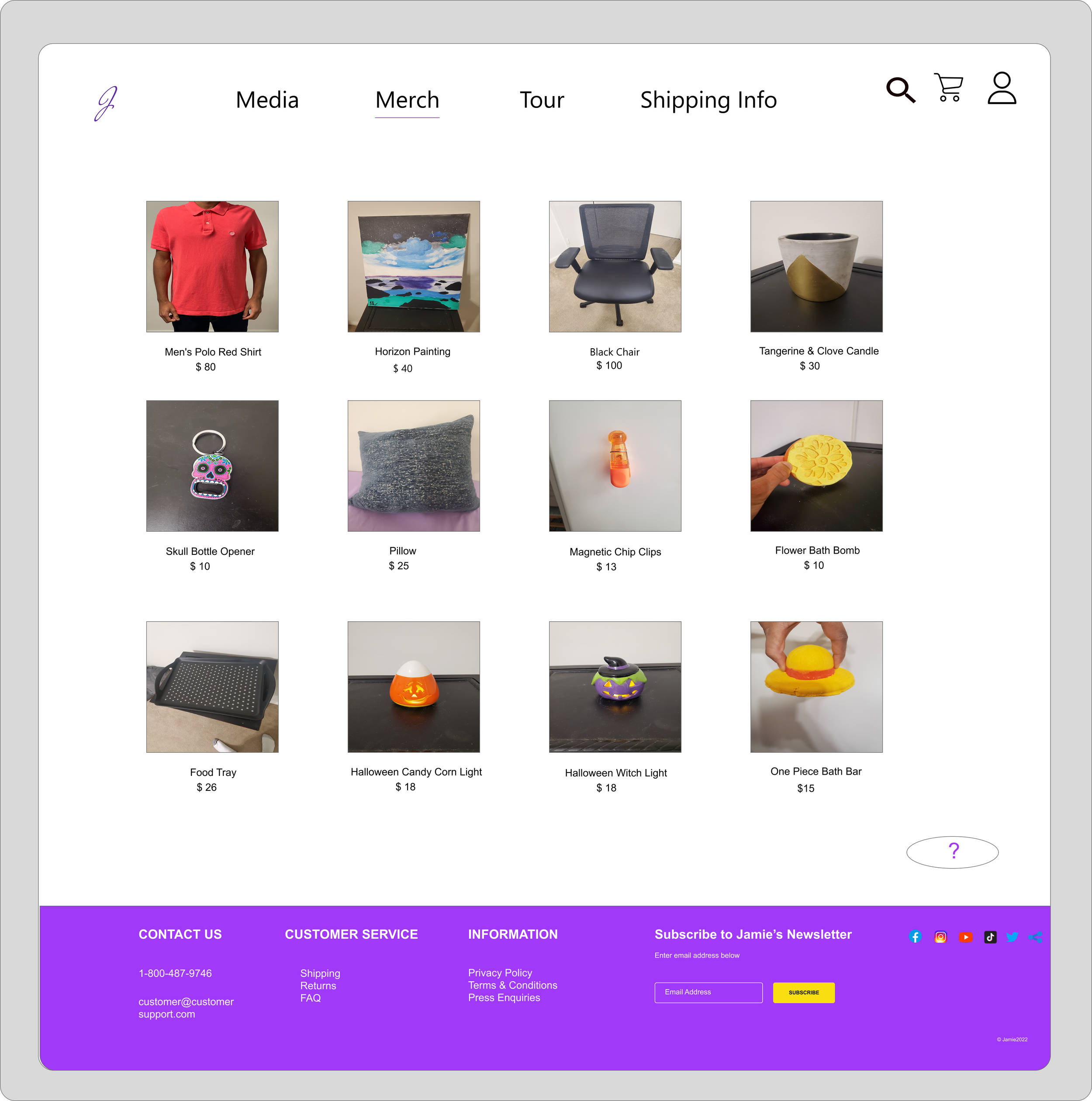
The website provides fans with the ability to buy his merchandise, see their upcoming tour schedule, and view music videos and photos by him
Role
I was the UX designer, UX research design lead
Responsibilities: User research, interviewing, ideation, wireframing, prototyping, iteration
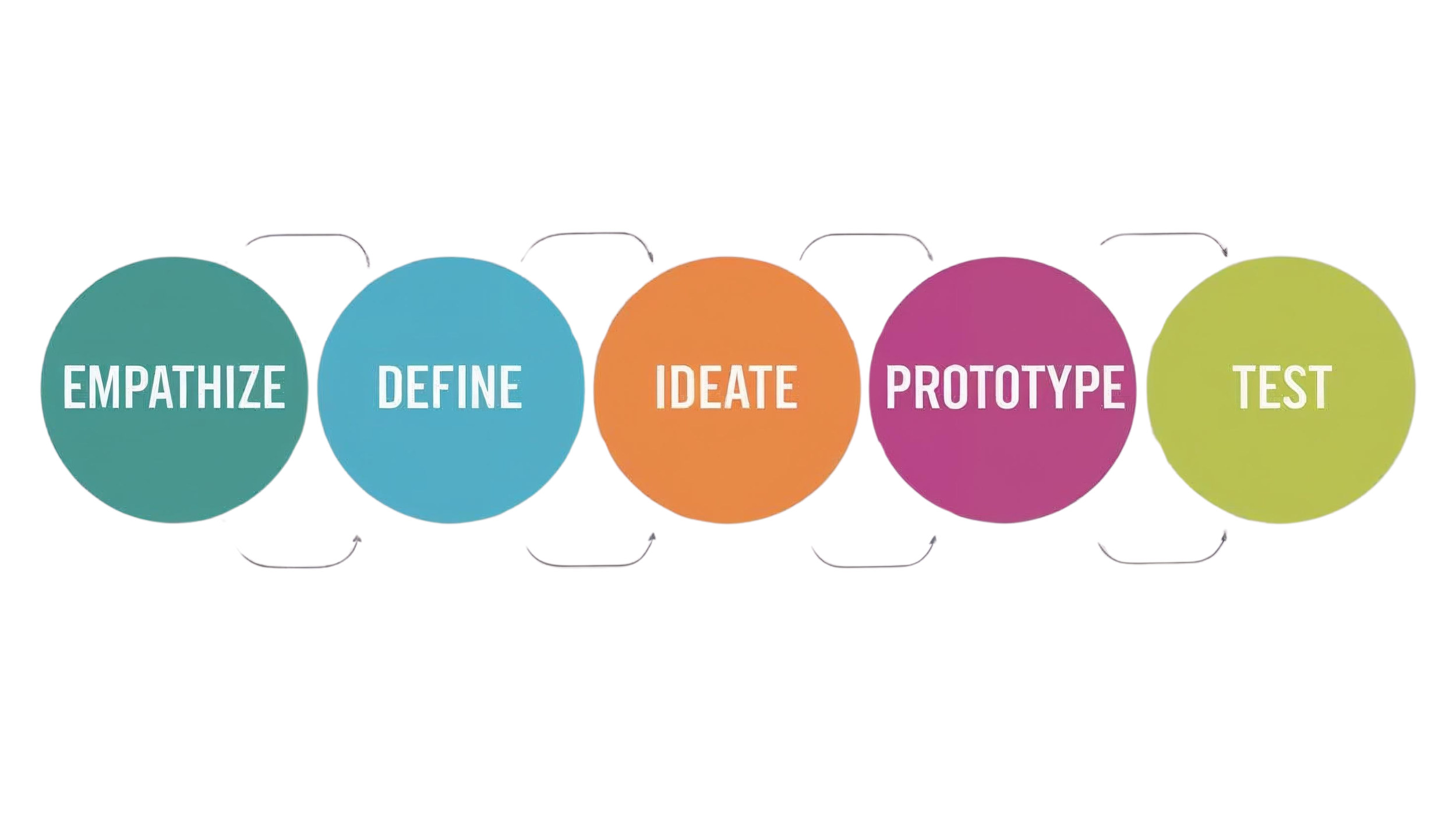
User-Centered Design Process
Justin Bieber
Pros:
When you hover over a shirt it automatically shows the backside of the shirt
Easy to navigate around the website
Return information can be found at the bottom of the page
Cons:
product page is very basic
Color scheme is black and white on home page then changes to light green on the checkout page
Competitive Audit
Pros:
brand is consistent throughout website
Unique and cool way to embed her videos for her fans to view
Cons:
Menu navigation on the shop page is not intuitive
No information about the products that are on sale
No distinction between men and women’s clothes
Pros:
Can translate the website to multiple languages
Pictures of product merch is Big and big font underneath
Cons:
No navigation when checking out the item
Inconsistent pink background (some merch have it, some dont)
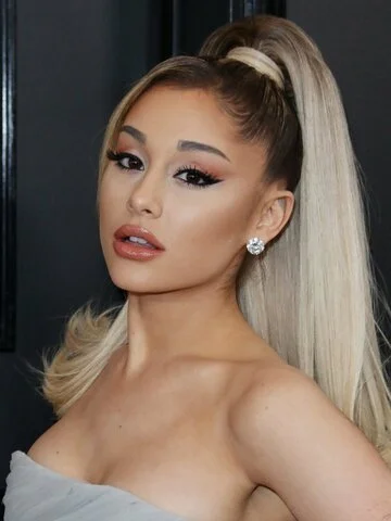
Ariana Grande
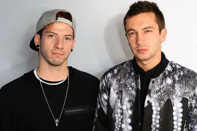
21 Pilots
How might we create an app for an up and coming artist that allows you to customize the merchandise, displays the different shipping tiers and provides customer support?
User Flow
Information Architecture
Design System
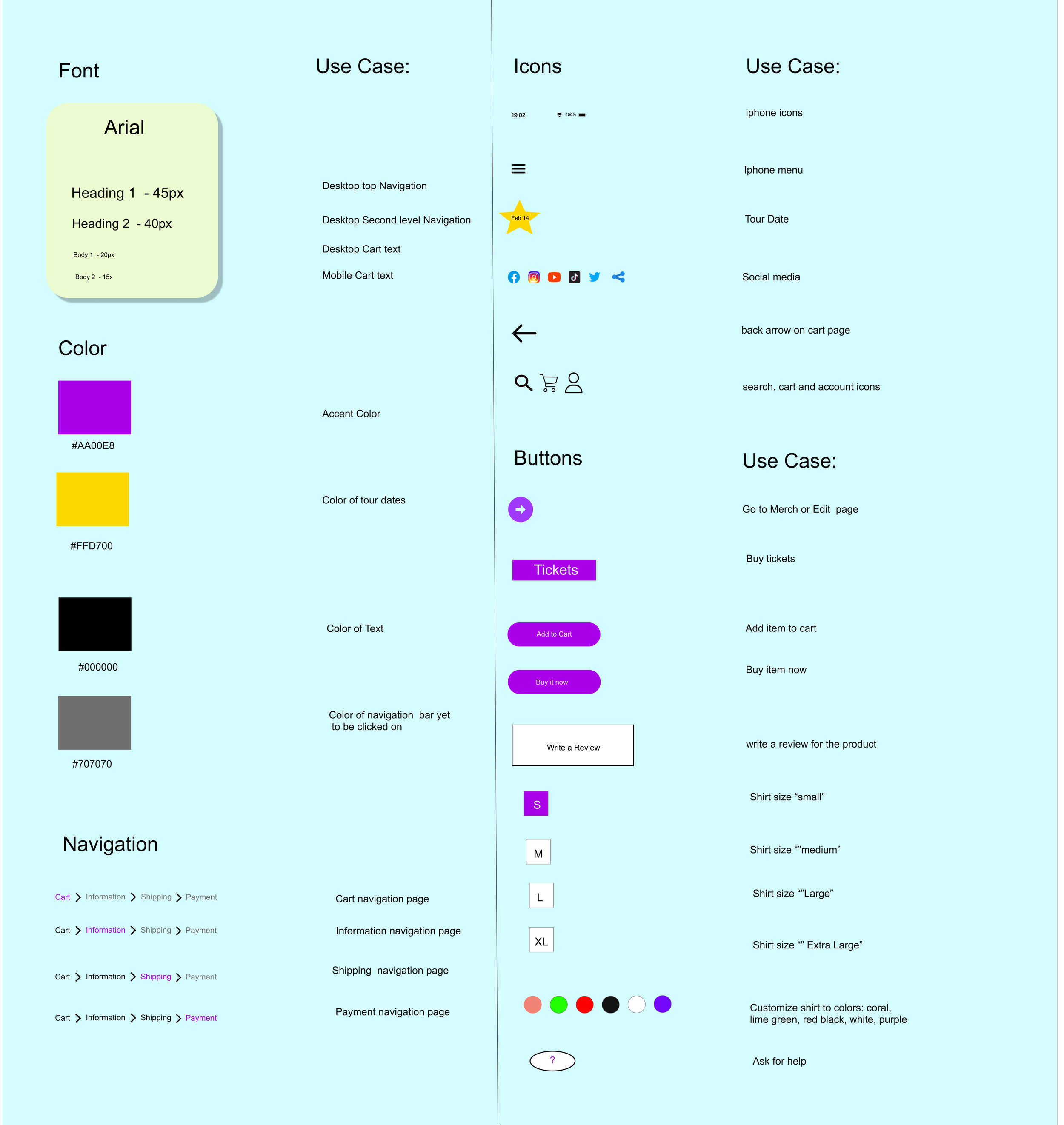
We needed to come up with a comprehensive design system to allow us to prototype faster and stay aligned with our goals
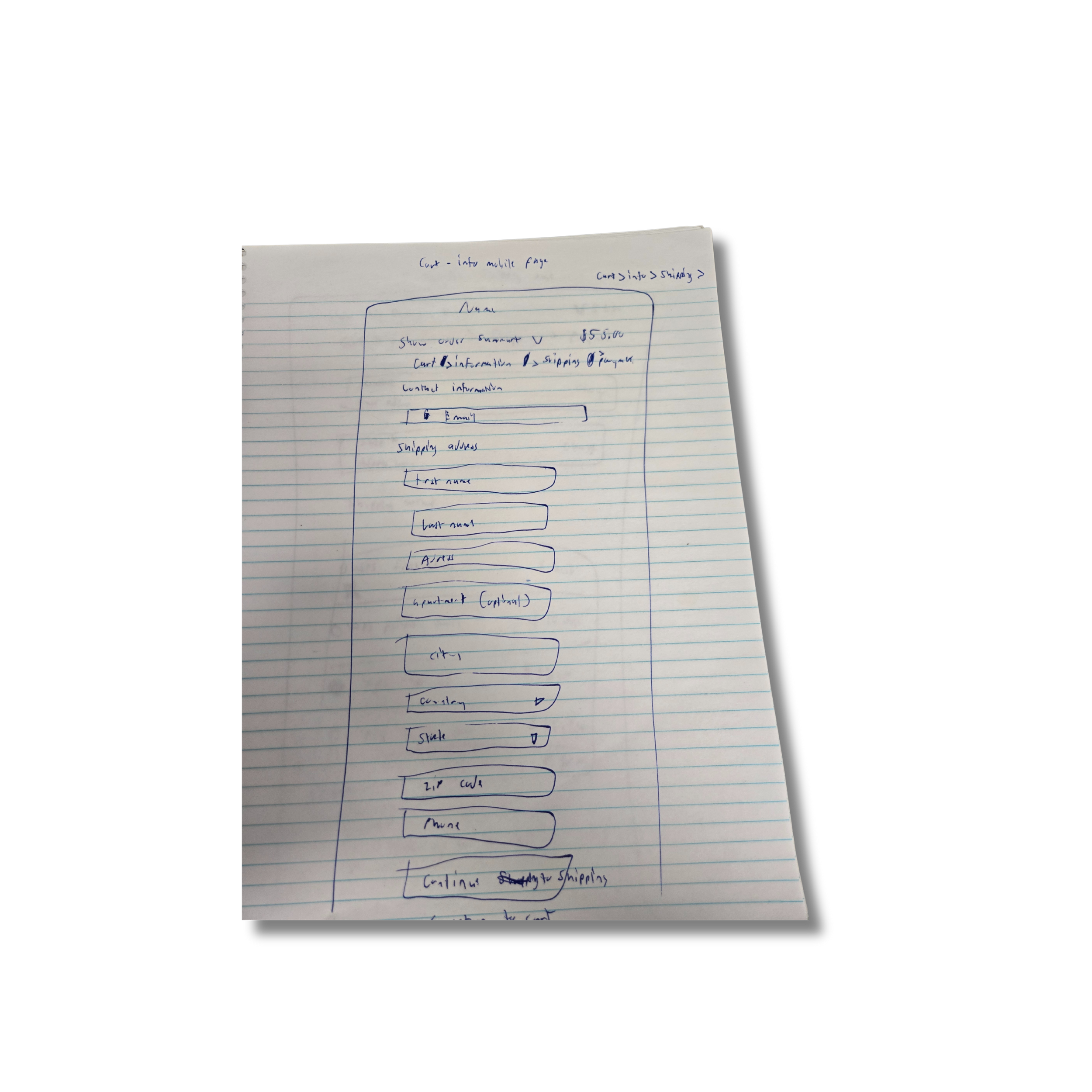
Paper Wireframes
Low Fidelity Wireframes - Mobile
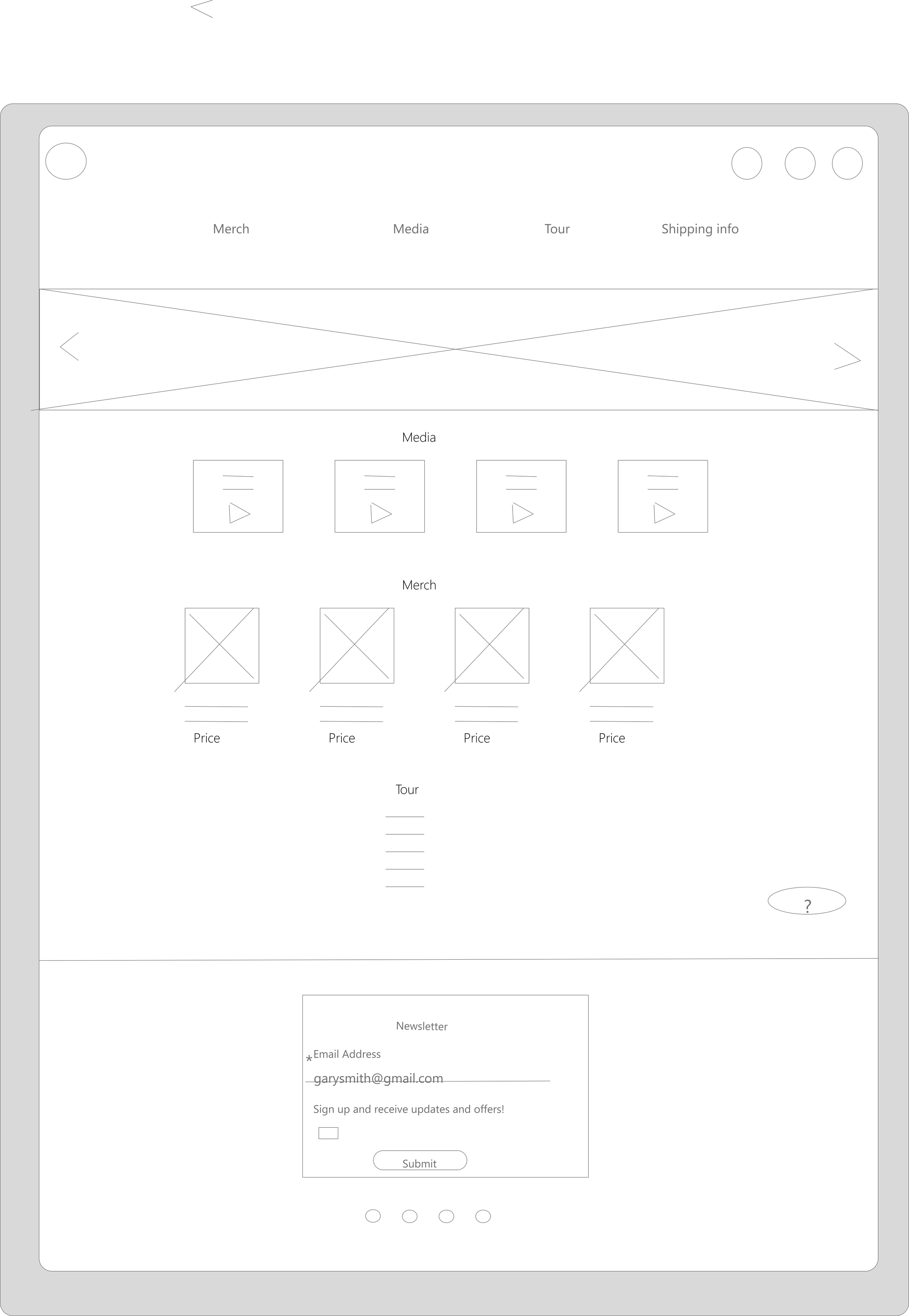
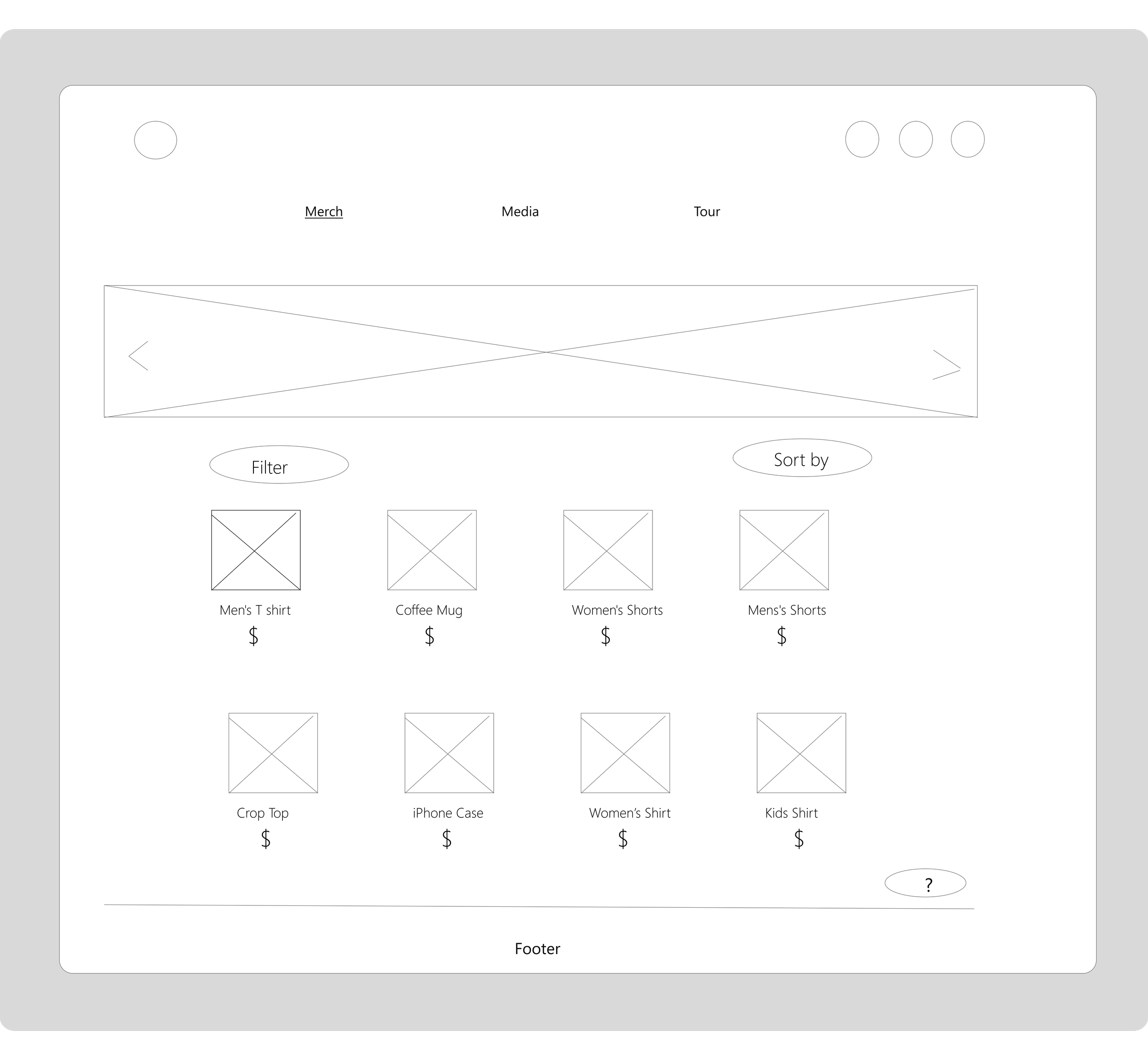
Low Fidelity Wireframes - Desktop
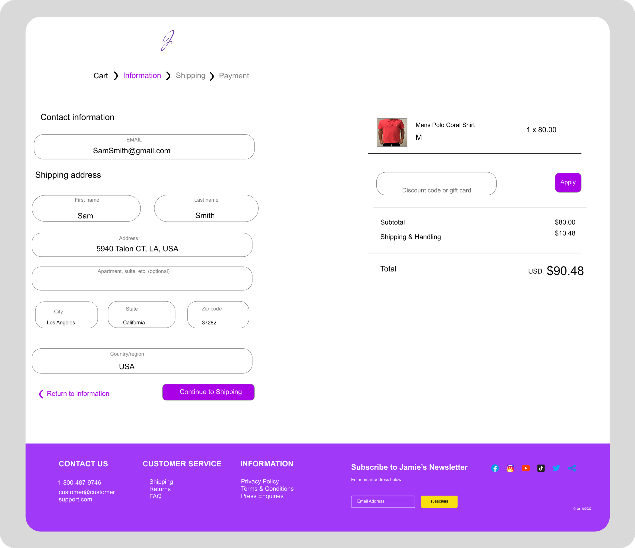
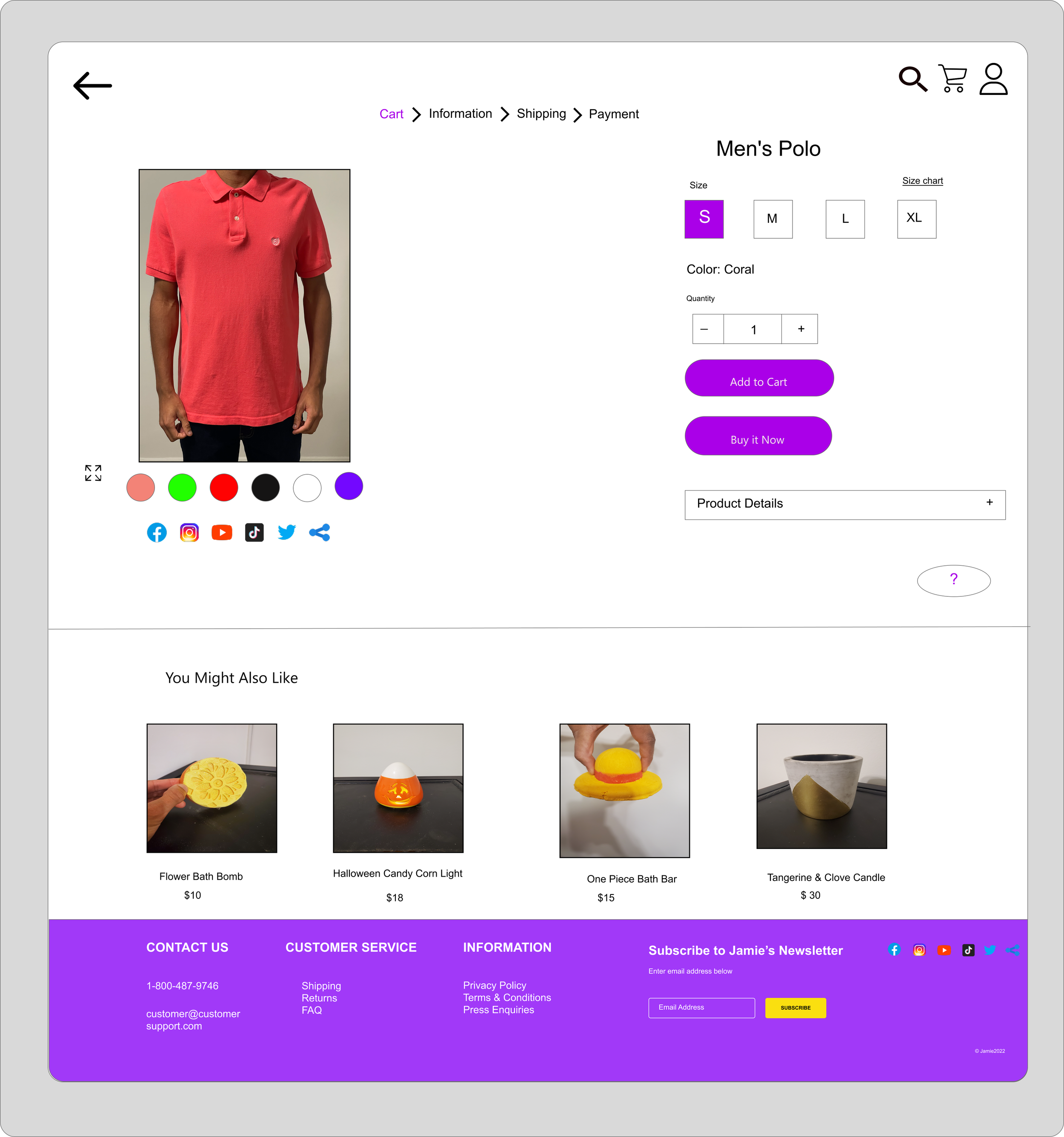
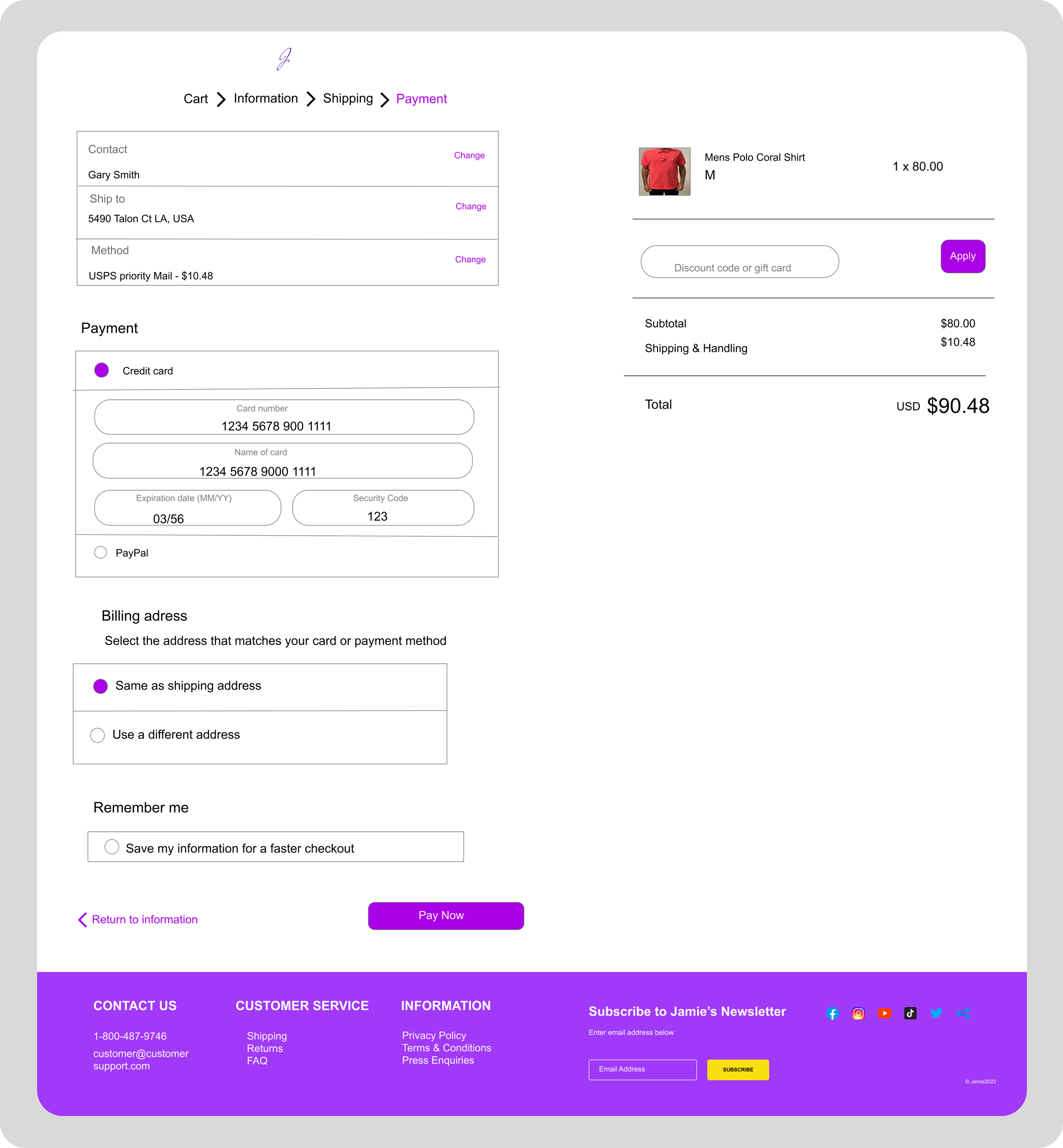
High Fidelity Designs
Usability Study
We conducted a 20 minute moderated usability study on our prototypes. We had 4 participants and we were measuring the participant’s ability to find the shipping label.
Insights
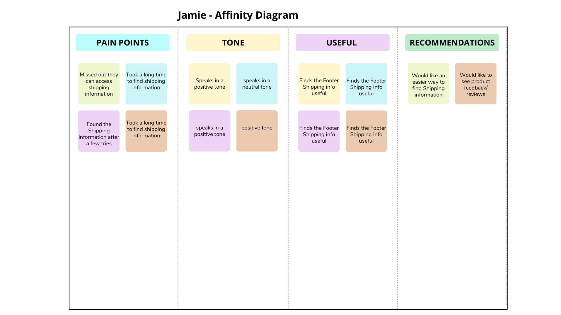
Main user pains points were:
Had trouble finding information about shipping
Wanted to see reviews on products
“The shipping label text is so small, I almost missed it” - Anonymous
Key Designs and Iterations
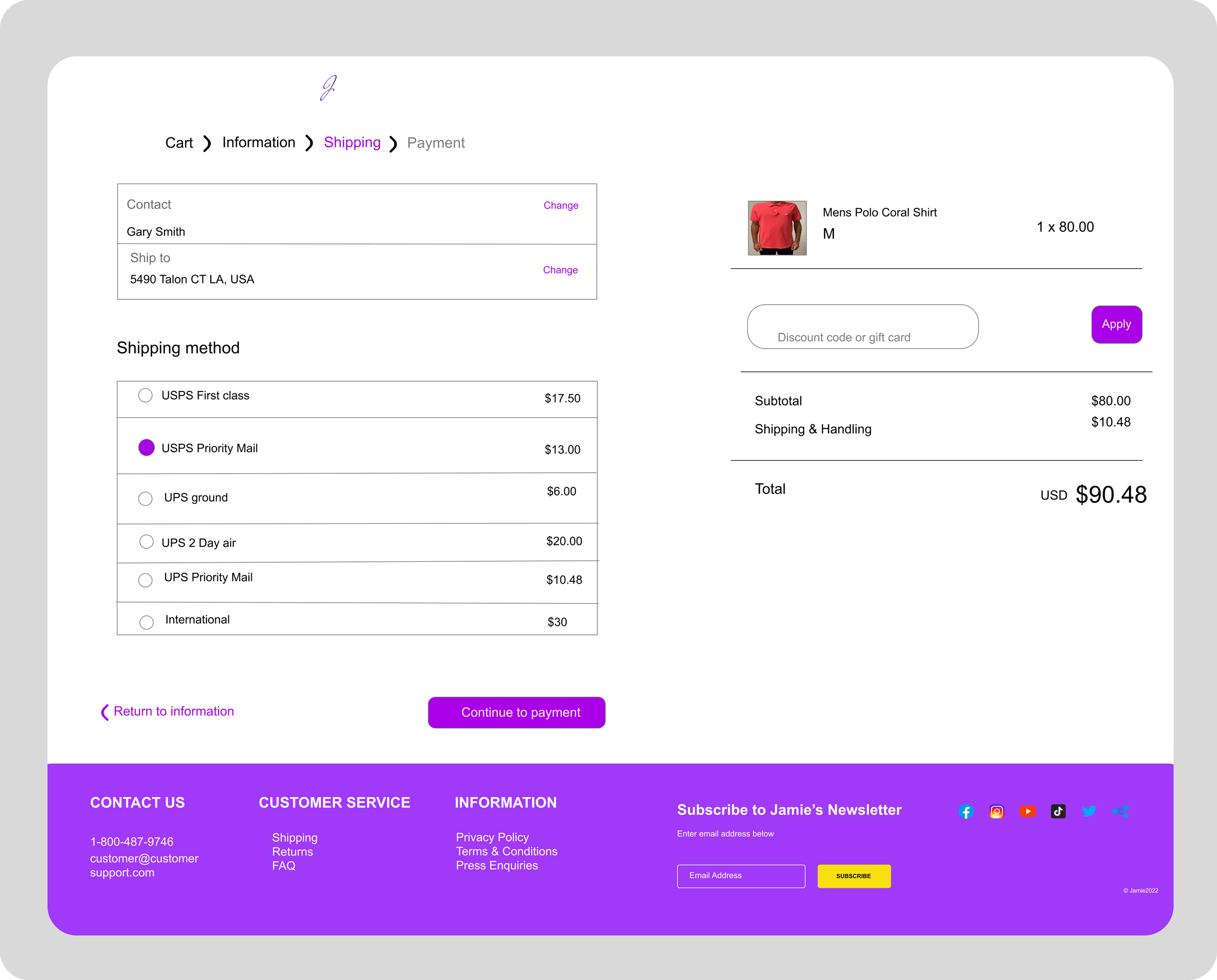
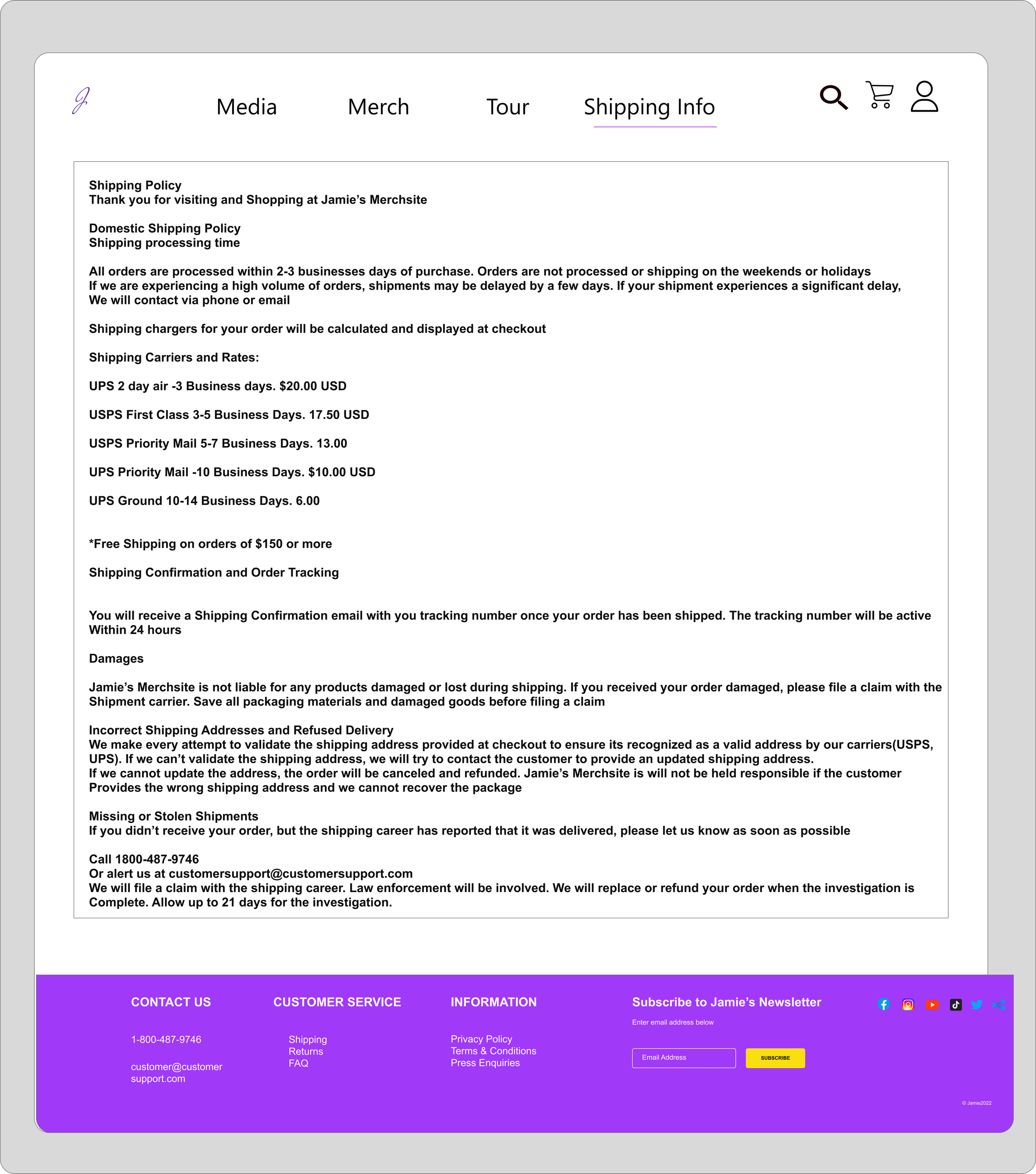
Shipping label information
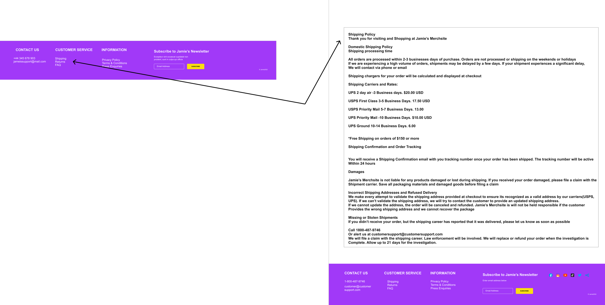
Our initial designs had shipping information at the footer of the page and then this would link you to the information.
Before = shipping label is at the footer ( this is standard for most artist’s websites)
After = Our usuablility study revealed that it was tough for users to find information about shipping. We asked ourselves “Does the shipping label only need to be found at the footer of the page? This led us to put the shipping information right underneath the product details and to build out a whole page for it
Result: Fans are able to choose different shipping tiers for when the merch will be delivered to them. Fans said they were more likely to buy products if they could choose the shipping
After
2. Product Customization
Users wanted the ability to change the color of the shirts so we built out this functionality for them
3. Sold out & Discounts
Users identified the issue of clicking on a item and then going into the checkout only to discover that the item was sold out. We now show the item as sold out from the beginning to alleviate this
Before= You could not tell which items were in stock or sold out
After = now fans can see a product is sold out/on sale up front
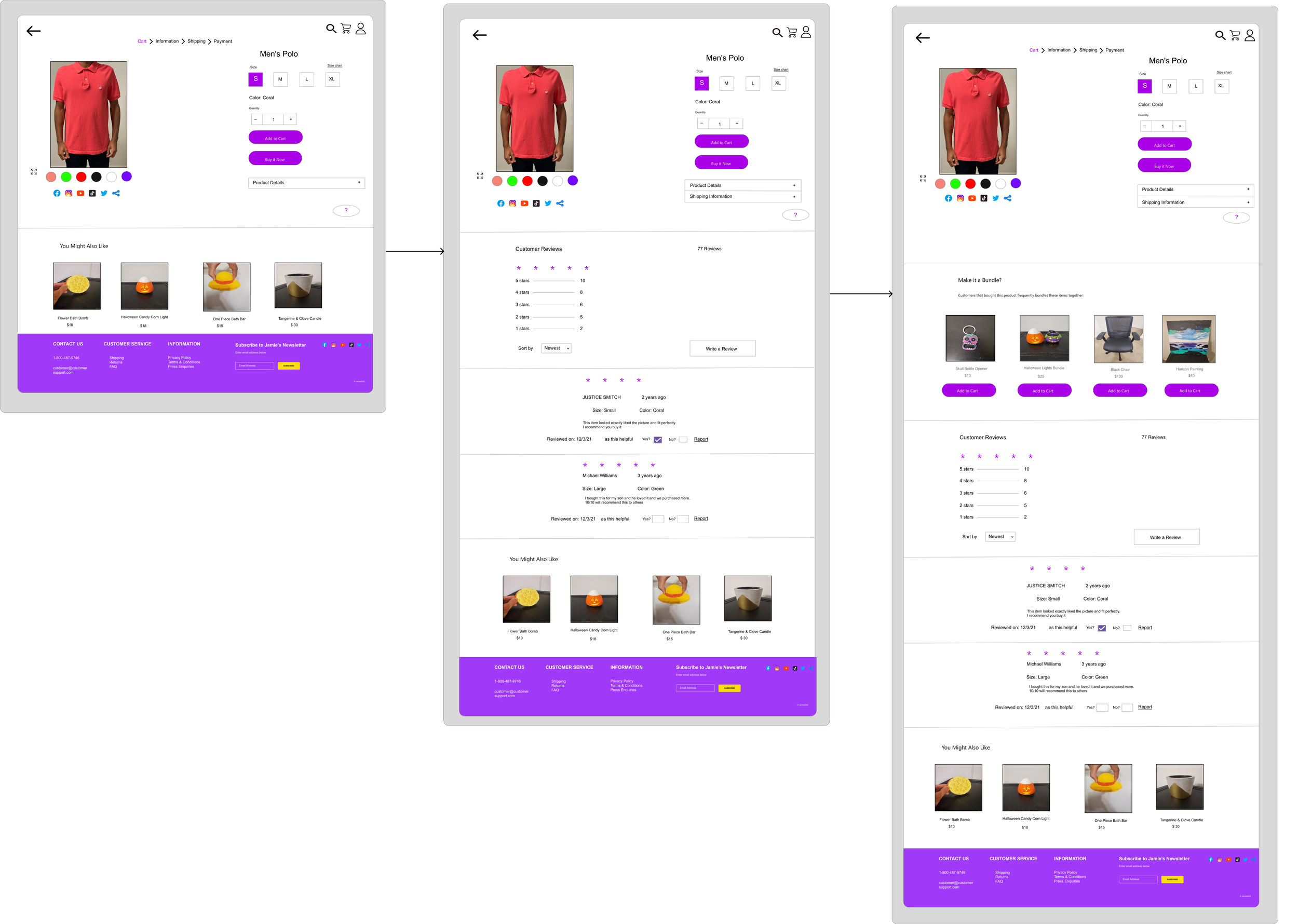
4. Reviews + Bundles
If you wanted to add different items to your order there was no way to do this except to scroll to the bottom of the page. Now we added a bundle feature to seamlessly add multiple items to the order.
A review feature was one of the recommendations we got from the usability study so we added it. Now fans have more information about the merchandise during their decision to buy.
Result: Our conversion rate of users completing the checkout process increased by 20%
Before
Result: Fans loved the ability to see which products were sold out ahead of time. This saved them minutes browsing the different products and gave them more time to focus on the products they were actually interested in.
Next Steps
Build out the ticketing platform so a fan will be able to book a ticket for a future performance from Jamie
Lessons Learned
Always ensure that design requests are compatible with design and development capabilities before starting to prevent redundant effort and time.
Lets build something great together
Before you head over to the next case study, Don’t forget to pick up some Jamie merchandise :)


