
Teatri
Overview
Our team was tasked with coming up with a movie trailer viewing application for the locals living in Rome because one does not exist.
The entertainment application will allow a user to enter their zip code and find the closest movie theater to them, choose a movie time, and view “now showing” and “up-coming” movie trailers.
Role
I was the UX designer, UX research design lead
Responsibilities: User research, interviewing, ideation, wireframing, prototyping, iteration
Challenges
Some challenges we encountered early on is that this is an application meant for the locals in Rome. Living in America we could not get any interviews for people living in Rome so our main research was second hand research found online
User-Centered Design Process


Pros:
Has a massive selection of trailers to view
You can watch multiple trailers in succession without having to go back to the main menu
Cons:
App is extremely glitchy
Needs more brandy identity and use of colors
Competitive Audit

Pros:
Brand is consistent throughout website
Unique and cool way to embed her videos for her fans to view
Cons:
No accessibility features such as: screen readers, subtitles
IMDB trailers must show an ad before every trailer of a show/movie

Pros:
Netflix uses artificial intelligence to suggest movie titles and shows to watch.
It also has a great word of mouth track record, so everyone has a friend or family member recommending shows/movies to them.
Cons:
Overwhelming amount of information. You can scroll forever
Not the best categorization. If you click “Romcom” it gives you 1000 titles not in alphabetical order and your


Personas

How might we create an app for an up and coming artist that allows you to customize the merchandise, displays the different shipping tiers and provides customer support?
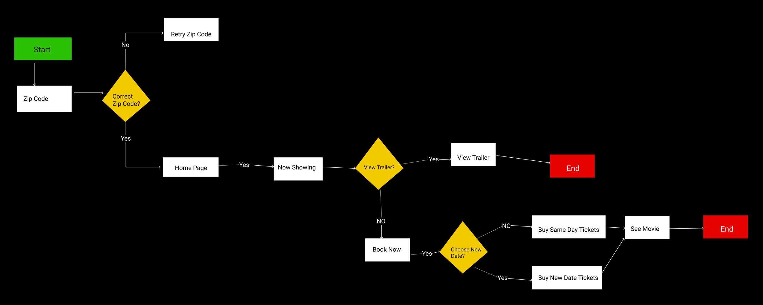
User Flow
Information Architecture

Design System
We needed to come up with a comprehensive design system to allow us to prototype faster and stay aligned with our goals


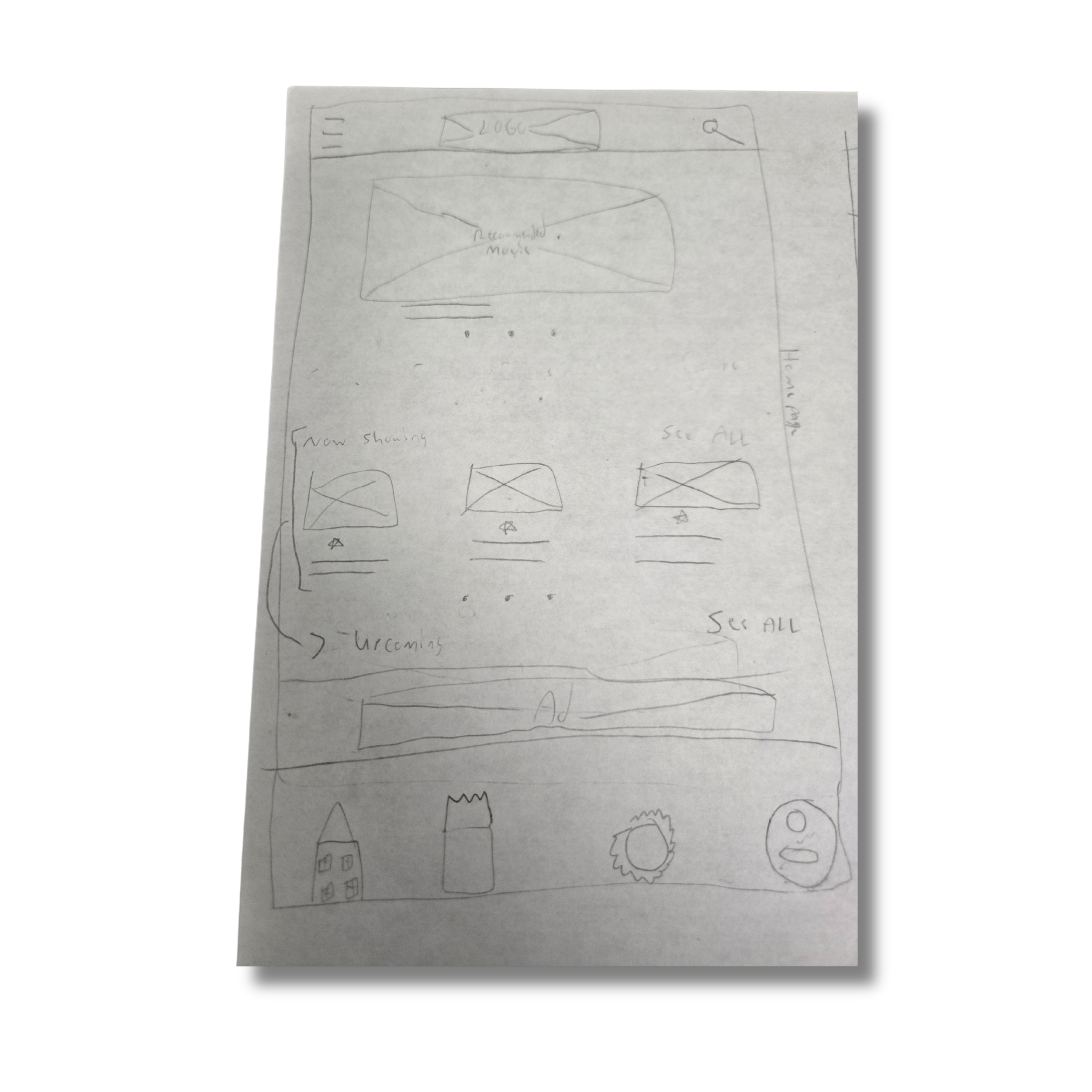
Paper Wireframes


Digital Wireframe
First Usability Study
We conducted a 30-minute moderated usability study on the digital prototypes. We had 5 participants and we were measuring the User error rates.
Insights
Our study showed us that these two screens were confusing missed our objective and needed to be redone. This saved us from wasting time creating these screens and created a better product in the end.

It is important to conduct a usability study on low fi mockups to prevent mistakes from getting into the final product. This saves time and money!
“It would be so nice to see more information about the movies” - Anonymous
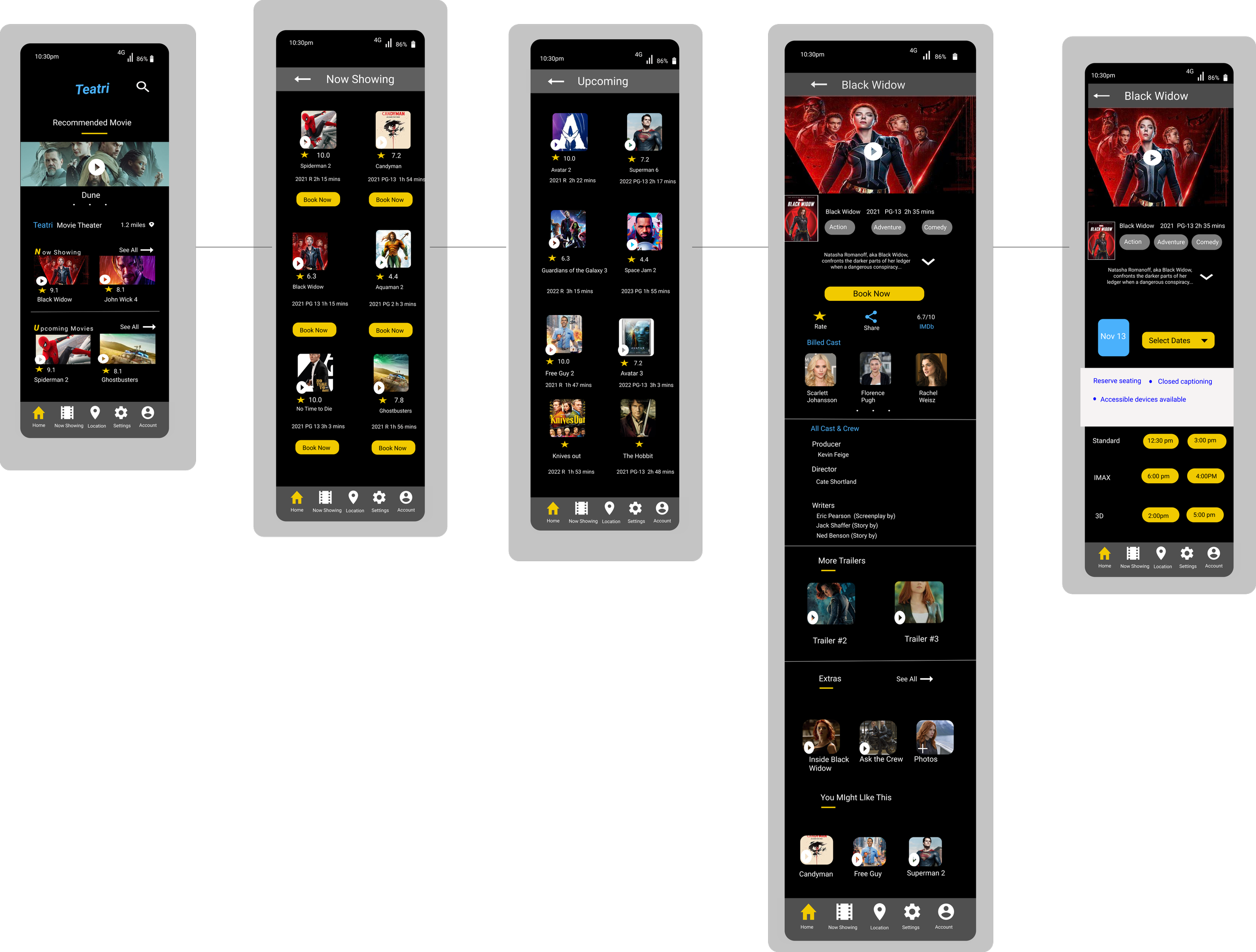
Here is a sample of the finished mockups. There was a second usability study conducted that reviewed some more pain points. Lets check them out below!
We conducted a 30-minute moderated usability study on the digital prototypes. We had 5 participants and we were measuring the User error rates.
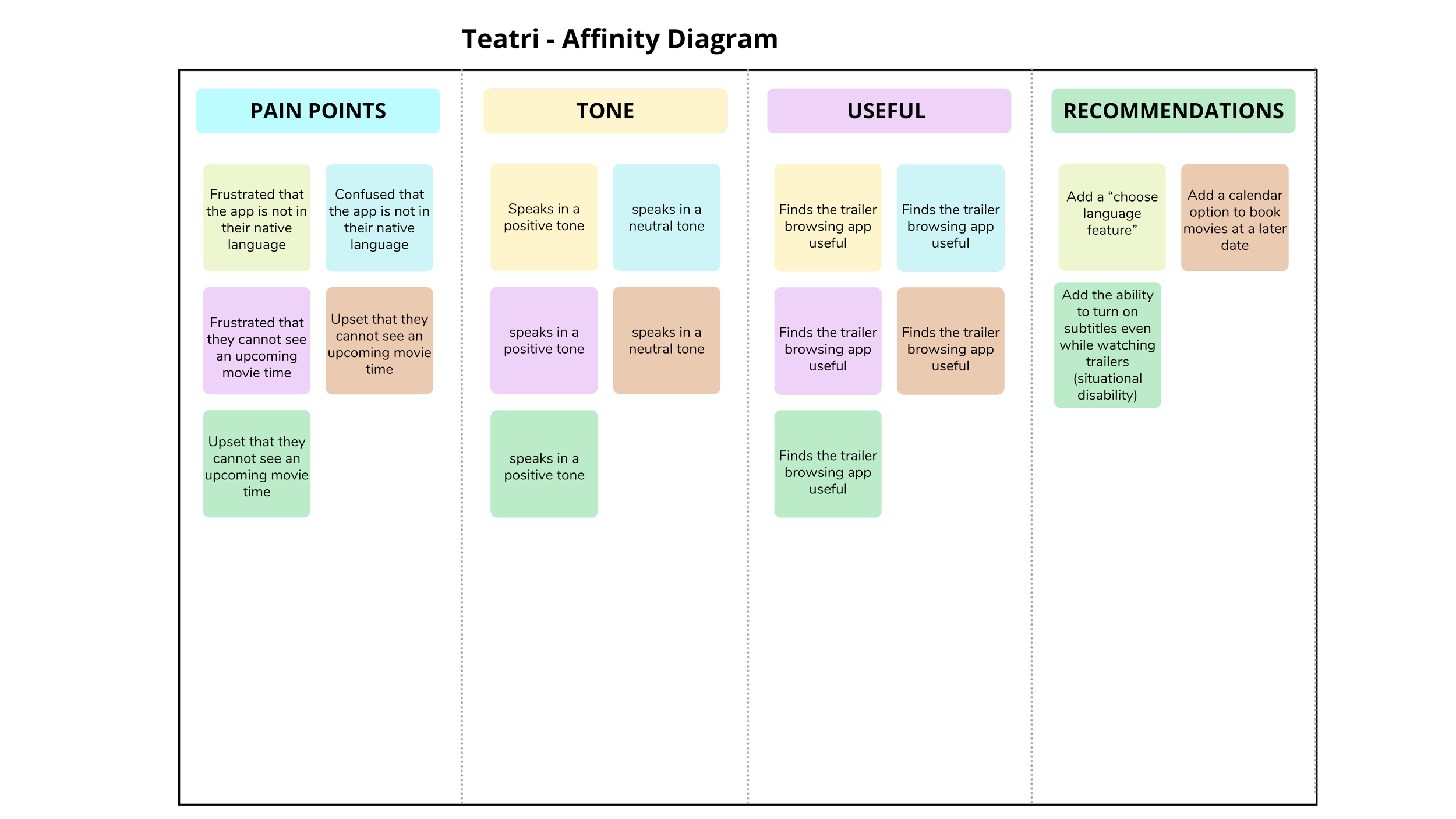
Main user pain points were:
Add a calendar feature to choose a movie time on a different date
App is not in the native Italian language
“I would be more inclined to go see a movie if I could choose my own date”
- Anonymous
Key Designs and Iterations
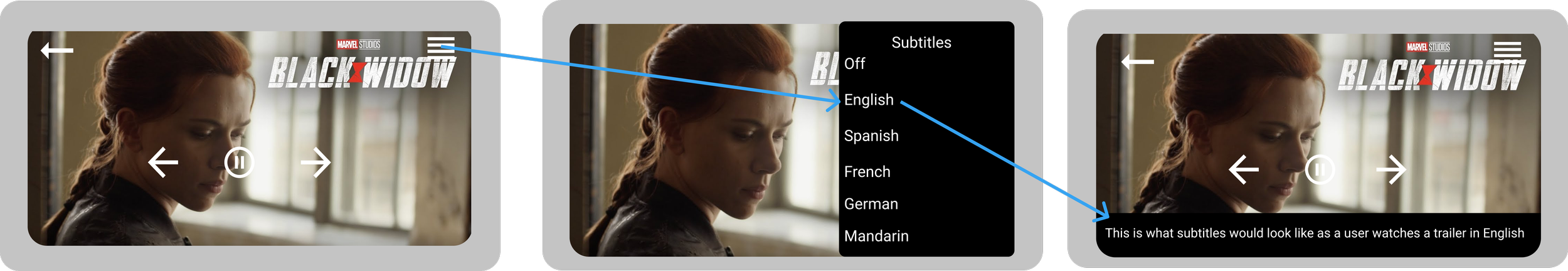
Subtitles
We needed to account for situational disabilities such as the ability of not being able to listen to a trailer at full volume so we needed to add a subtitle feature. We needed to account for multiple languages since Rome is a global city
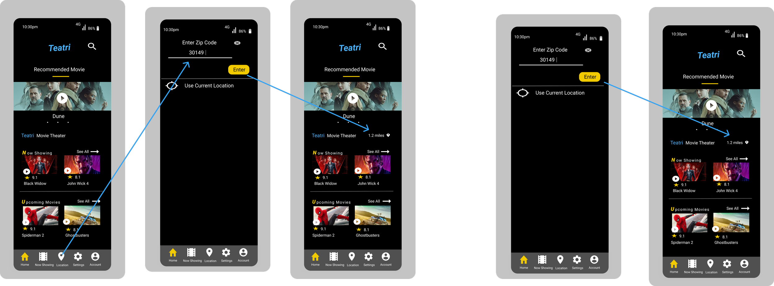
3. Zip Code Entry
In order for people to find movie theaters closest to you regardless of location in rome, we need to enter your zip code to be able to find nearest theater. You had to click on “location” to enter your zip code. We changed it so now when you log in you have to enter your Zip code first before seeing the home screen

Before
Results: This resolved a significant pain point felt by our users and improved the experience for our users
After
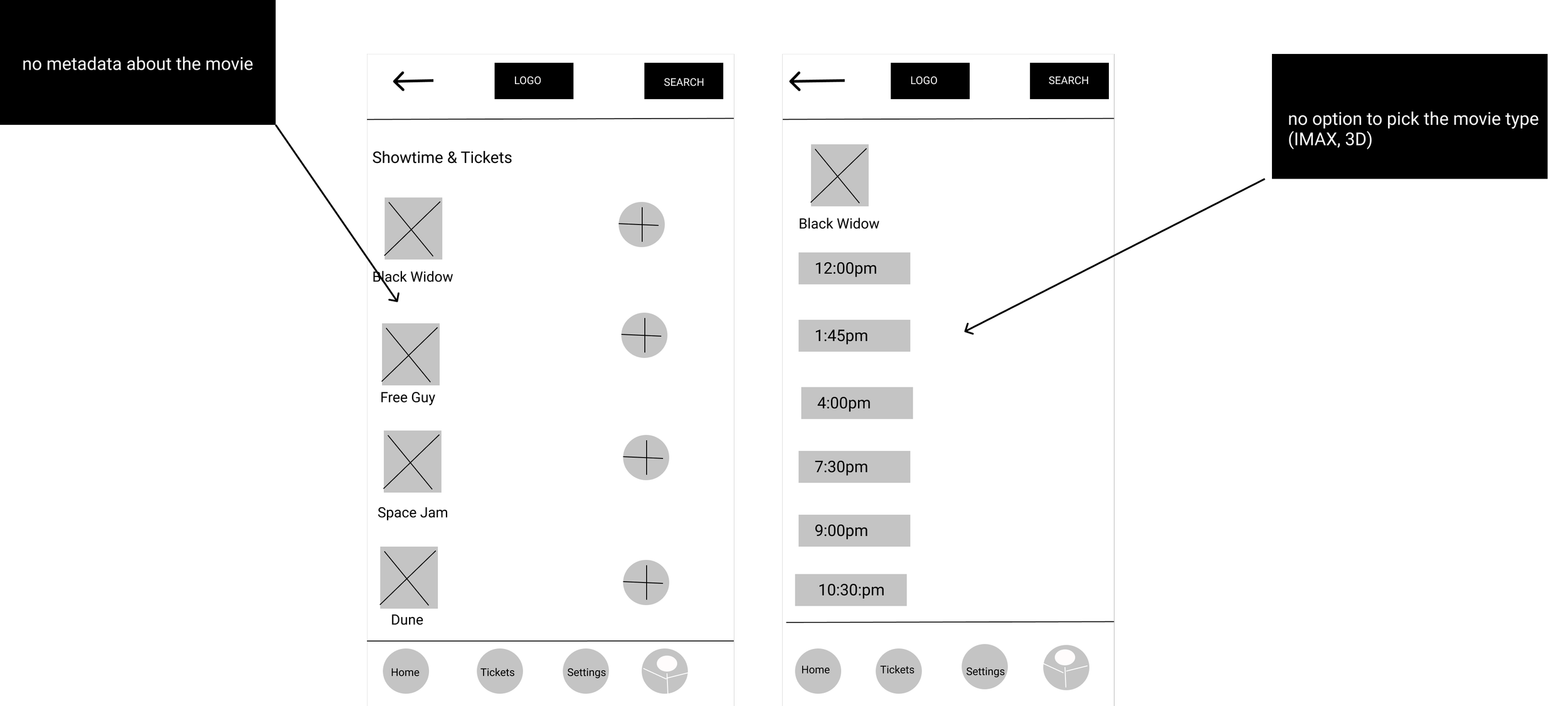
4. Movie metadata
We wanted to give users the ability to see meta about how the movie was made: bloopers, photos during filming, and extras
Most locals in Rome speak Italian so we needed to design an Italian version of the app.
Problem: The Home page would default to the Italian version of the app when you first sign in. And then you would have to change the language
Solution: After you download the app, you are asked to choose your language first and this fixed the problem.
2. Language Localization
Result: This provided an improved user flow for the app and a better experience for the users. It also resolved a pain point felt by our users.
5. Calendar option
Our research showed that users were more likely to complete the checkout process if they had the ability to choose a movie time on a different day. This meant we had to build out a calendar feature

Result: Our app is more engaging with our users by providing information movie metadata. Our users loved this feature

Result: Locals said they were more likely to purchase a ticket and go to a local movie theater by having a calendar feature built into the app. We achieved our desired outcome
Results: Our application is more accessible and inclusive which benefits everyone.
Next Steps
We would build out the ticket buying process which would include: choosing your seat, imputing your credit card information buying the ticket. We would also include creating a loyalty rewards section so you could rack up and redeem points if you were a loyal custome
Lessons Learned
The geographic location of this app was challenging which emphasizes the importance of how much the location of your users matter. There are about to be a billion more users using the internet for the first time, so we need to design solutions which them in mind