
Financial Titans
Overview
Financial Titans is a high school financial literacy course to provide young adults with financial literacy skills to apply in the real world.
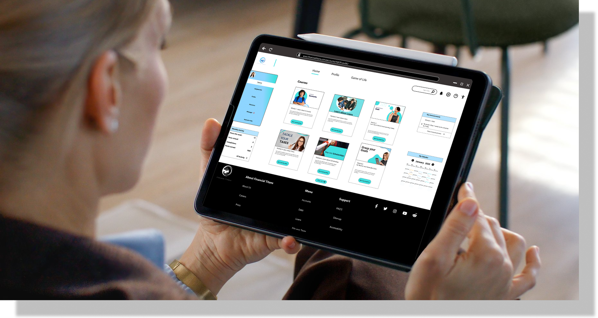
The website provides young adults with the ability to take multiple modules and learn key financial terms through knowledge checks and quizzes.
Role
I was the UX designer, UX research design lead
Responsibilities: User research, interviewing, ideation, wireframing, prototyping, iteration
Challenges
Teaching children financial literacy is a real problem and there are not many courses out there to do market research on. We encountered two problems:
The few high school courses that exist, on the sign in page make you type in your high school code. If you are not affiliated with a high school you cannot proceed further.
They cost money to sign up so in order to do initial market research on them, you will have to pay money up front.
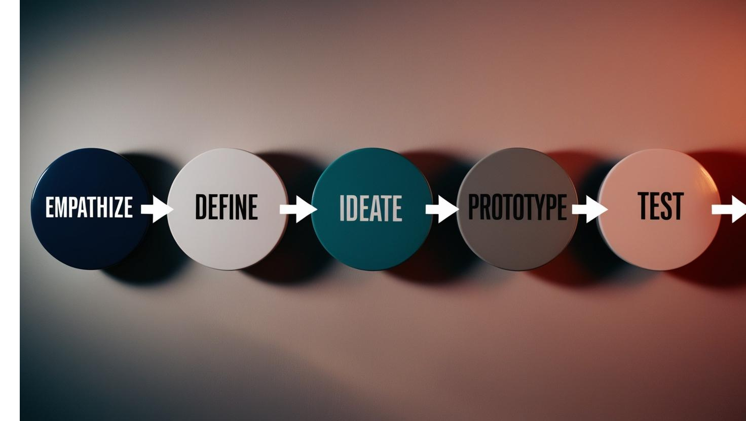
User-Centered Design Process

Consumer Finance
Pros:
A lot of great content available for young adults: buying a car, moving into a new house.
Content is fun and engaging for a younger audience
Contains a lot of pictures and charts for easy to digest content
Cons:
Content is hard to find (many clicks)
Too much information is linked to other sites and not found on the actual site
Competitive Audit

Finaid
Pros:
Goes in depth on how to pick and choose between different loan options
Helpful feature to project how much your college tuition will cost
Cons:
Content is not at a beginner level to understand
Information hierarchy is off. It asks you to calculate the interest term on a loan first, and then farther down the page it gives you the definition of the terms.
ASFA
Pros:
Has resources in different languages which is very inclusive
Has development programs for continual learning
Has local events where young adults can attend seminars
Cons:
You need to pay for basic features and content
Videos are 30 seconds or less and then asks you to sign up and pay.
Pain Points


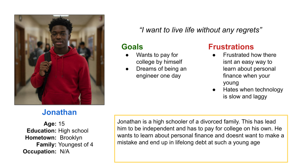
Personas
How might we create a fun and engaging website that teaches young adults smart financial literacy habits that they will utilize for the rest of their lives?
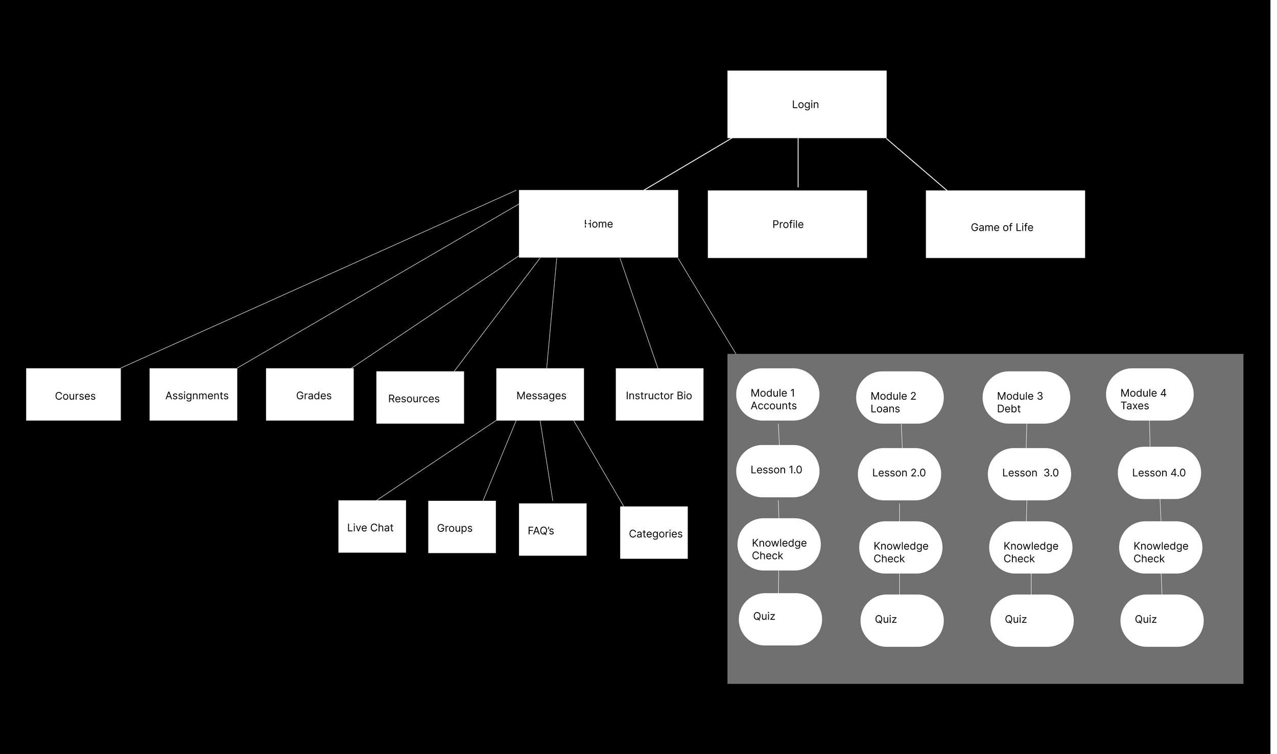
Information Architecture
Design System
We needed to come up with a comprehensive design system to allow us to prototype faster and stay aligned with our goals


We conducted a Crazy' 8’s exercise to generate a bunch of ideas for the layout of our courses and their features

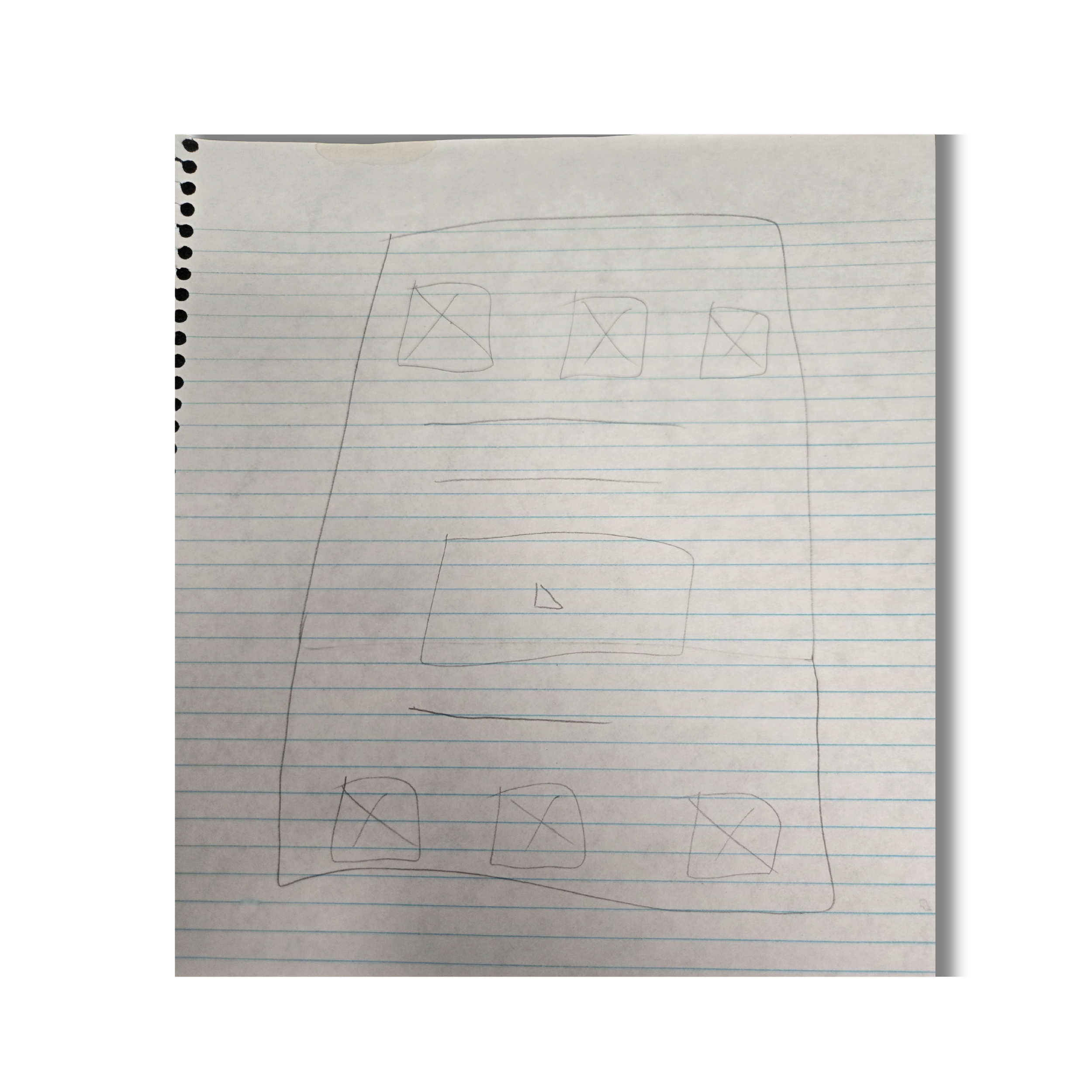


Low fidelity Mockups
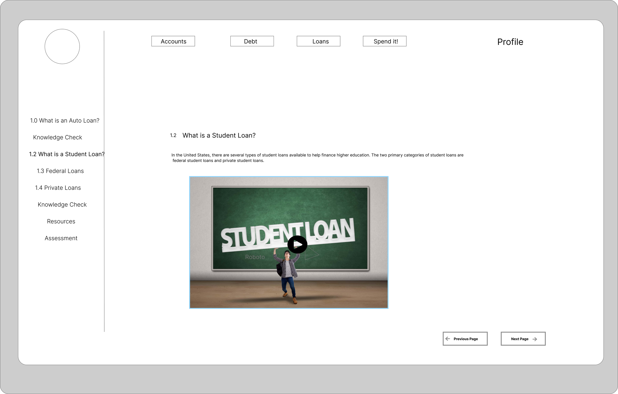

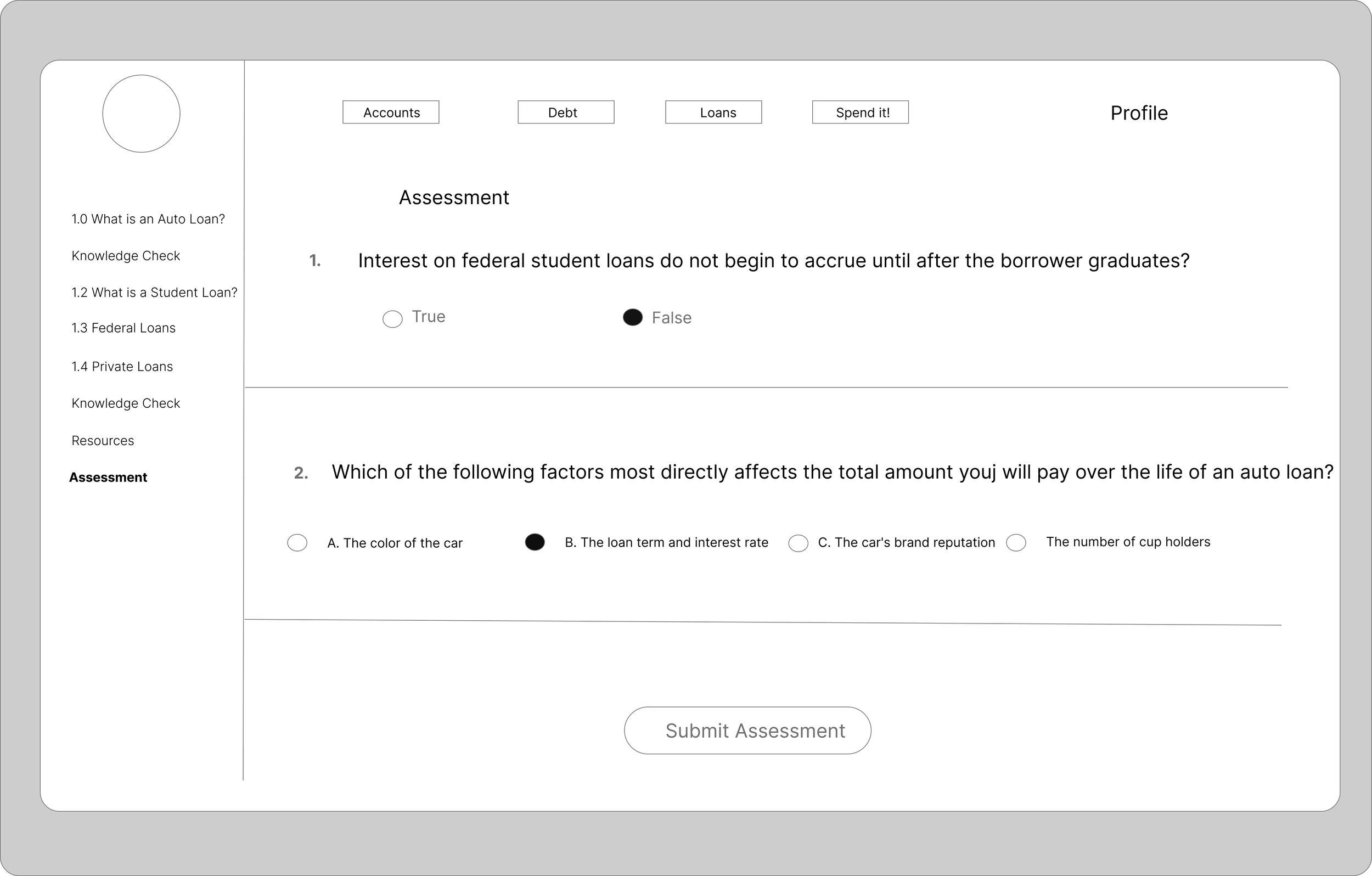


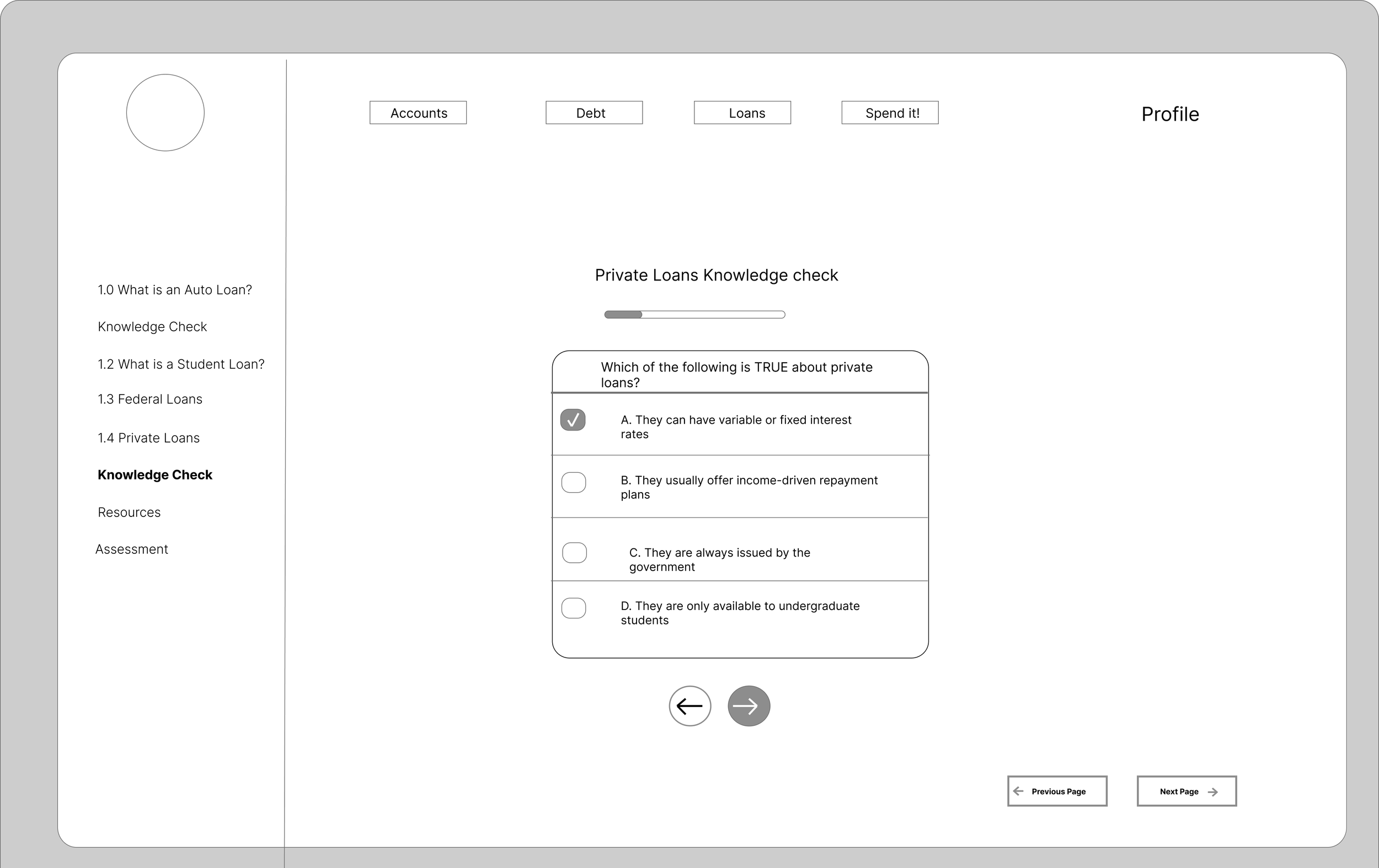
High fidelity Mockups


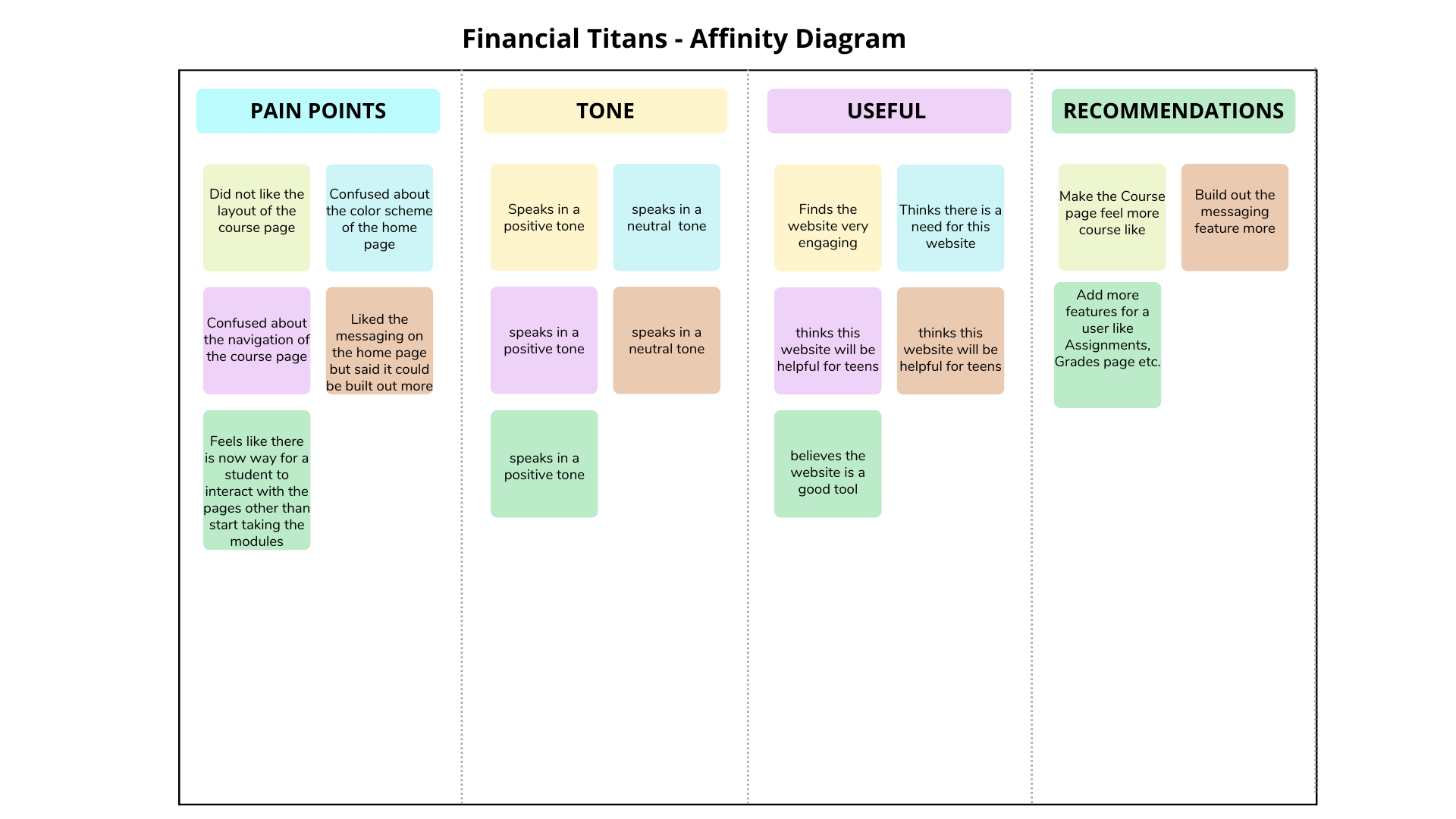
Usability study
We conducted a 30 minute unmoderated usability study with 5 participants. We were looking for user error rates, drop off rates, and product enhancements.
Insight
The main pain points were:
The main home page was confusing and it did not feel like you were actually taking a course.
Build out the chat feature more instead of having one long chat feed per course
“Everything about this website feels like a real course…except the home page” - Anonymous
Key Designs and Iterations
1. Changed the Sign-in page
2. Changed the Login page
We determined the sign in page did not capture the essence of our website. The blue color made it hard to see our text and the sign in page did not show our primary colors enough. We changed the page to be horizontal and make the text boxes rectangular to align with the rest of the elements on the page
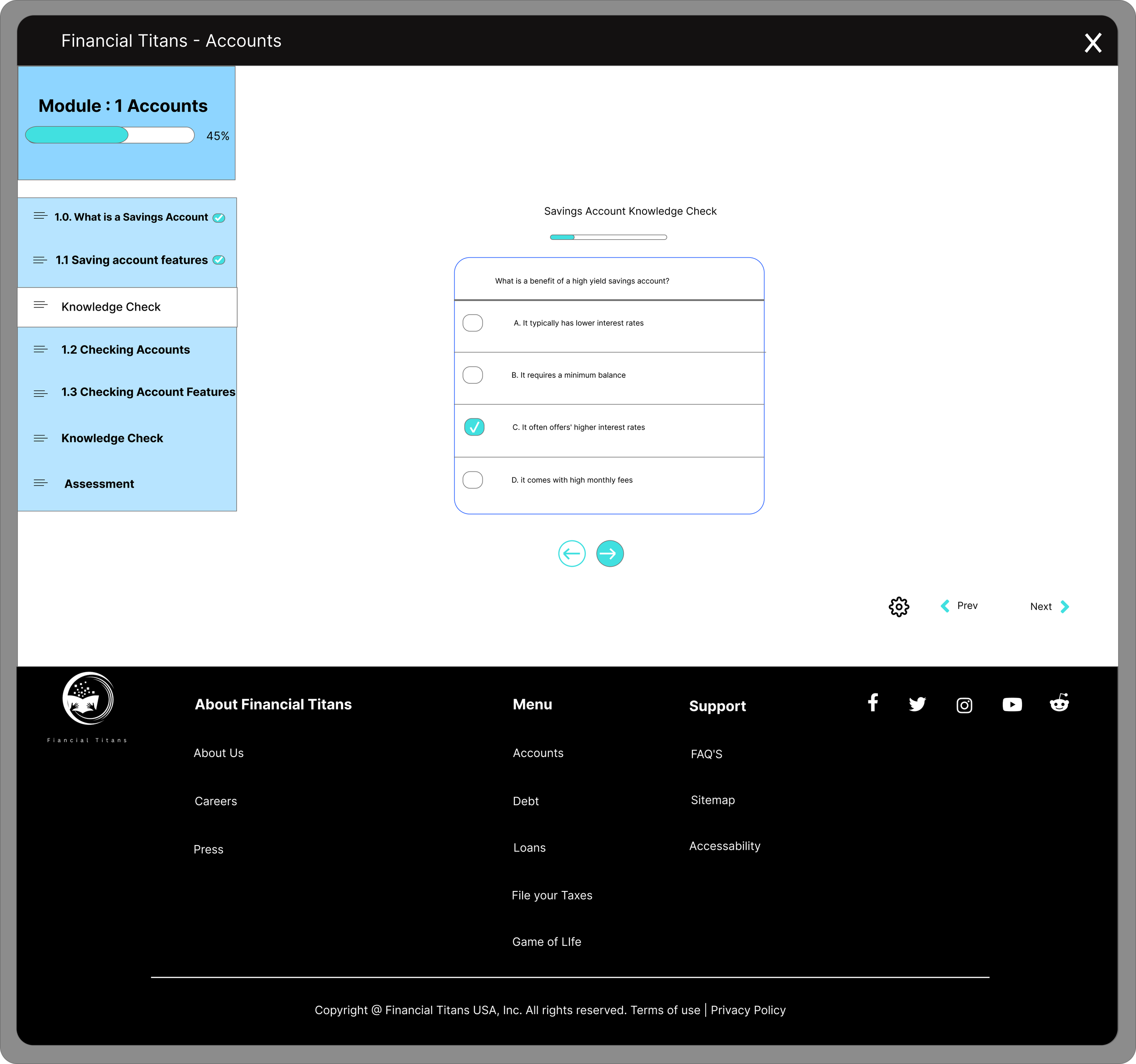
Our feedback let us know that the home page was not that intuitive and confused our users. We decided to make it more course like by adding an: assignments, grades, instructor bio pages, and a messaging feature.
Before
Results: Our Sing-in page now aligns with our brand awareness and objectives.

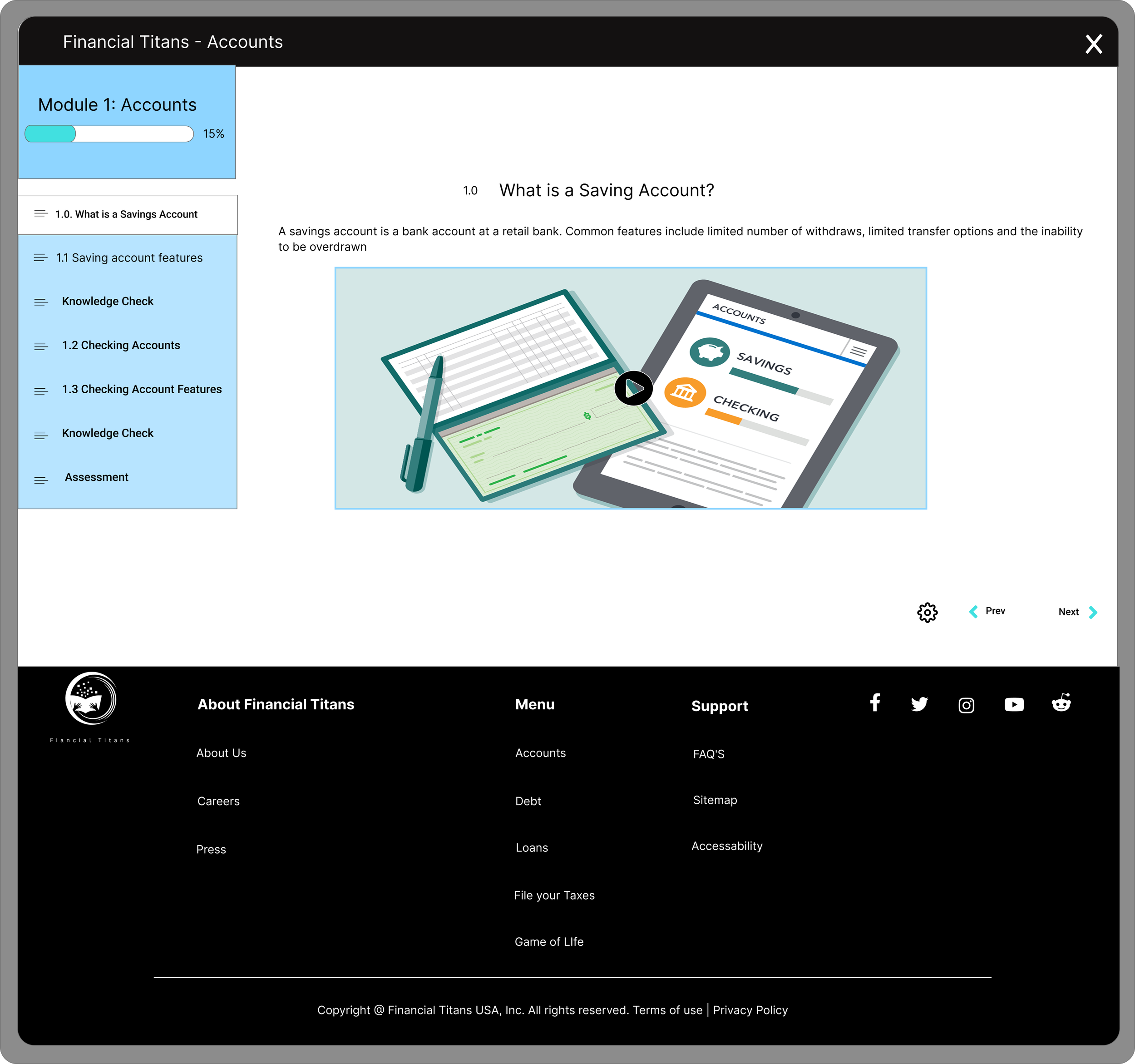
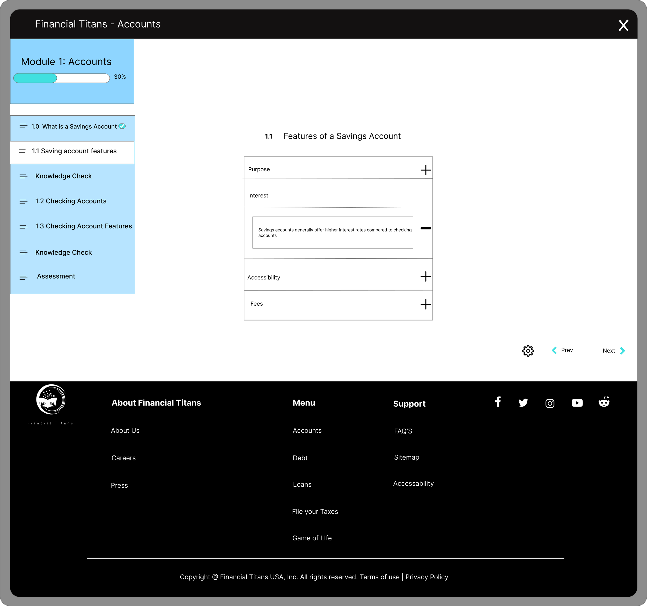
Discover home page
Resources Home page
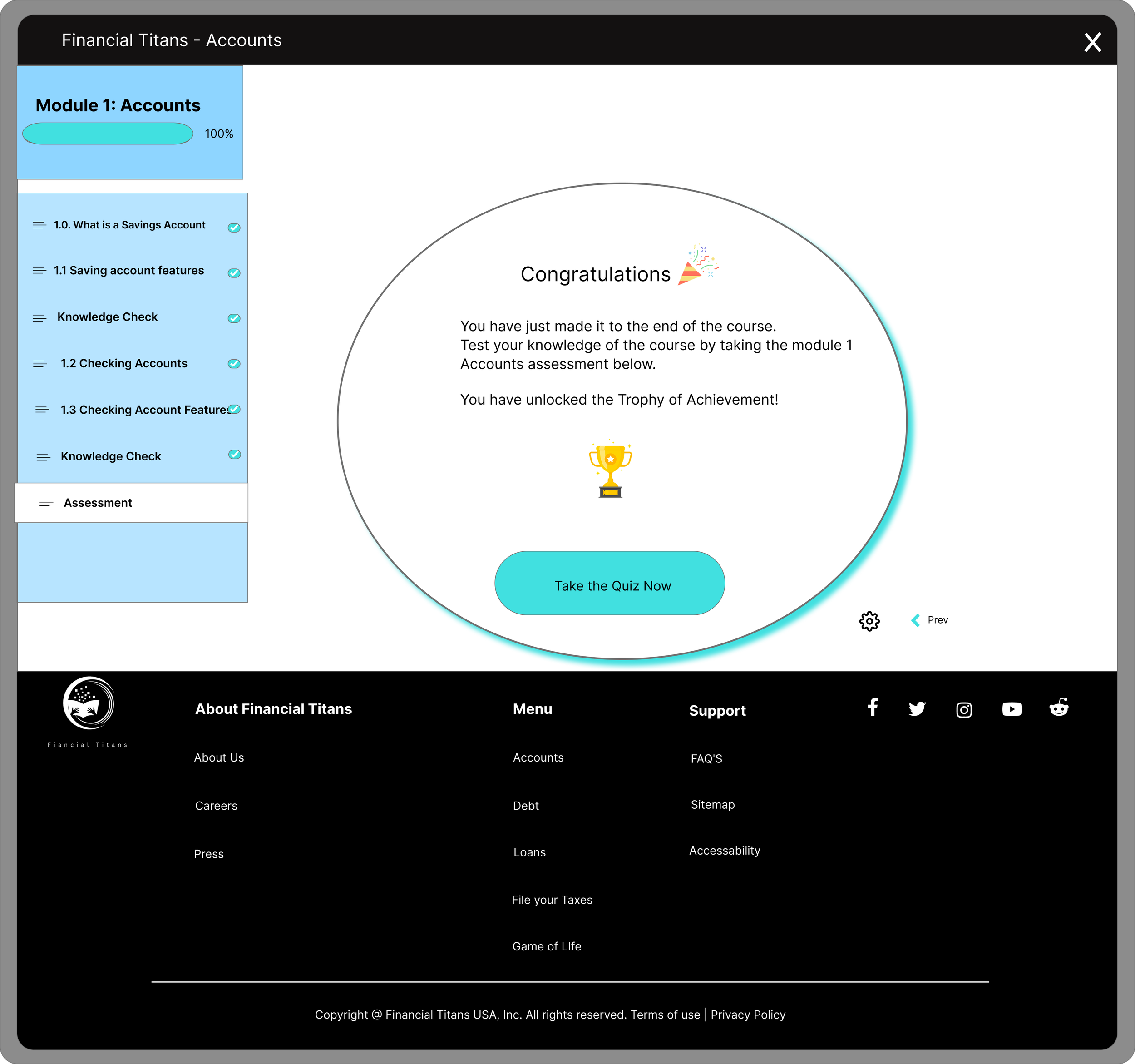
Assignments page
Messaging - Live Chat Home page
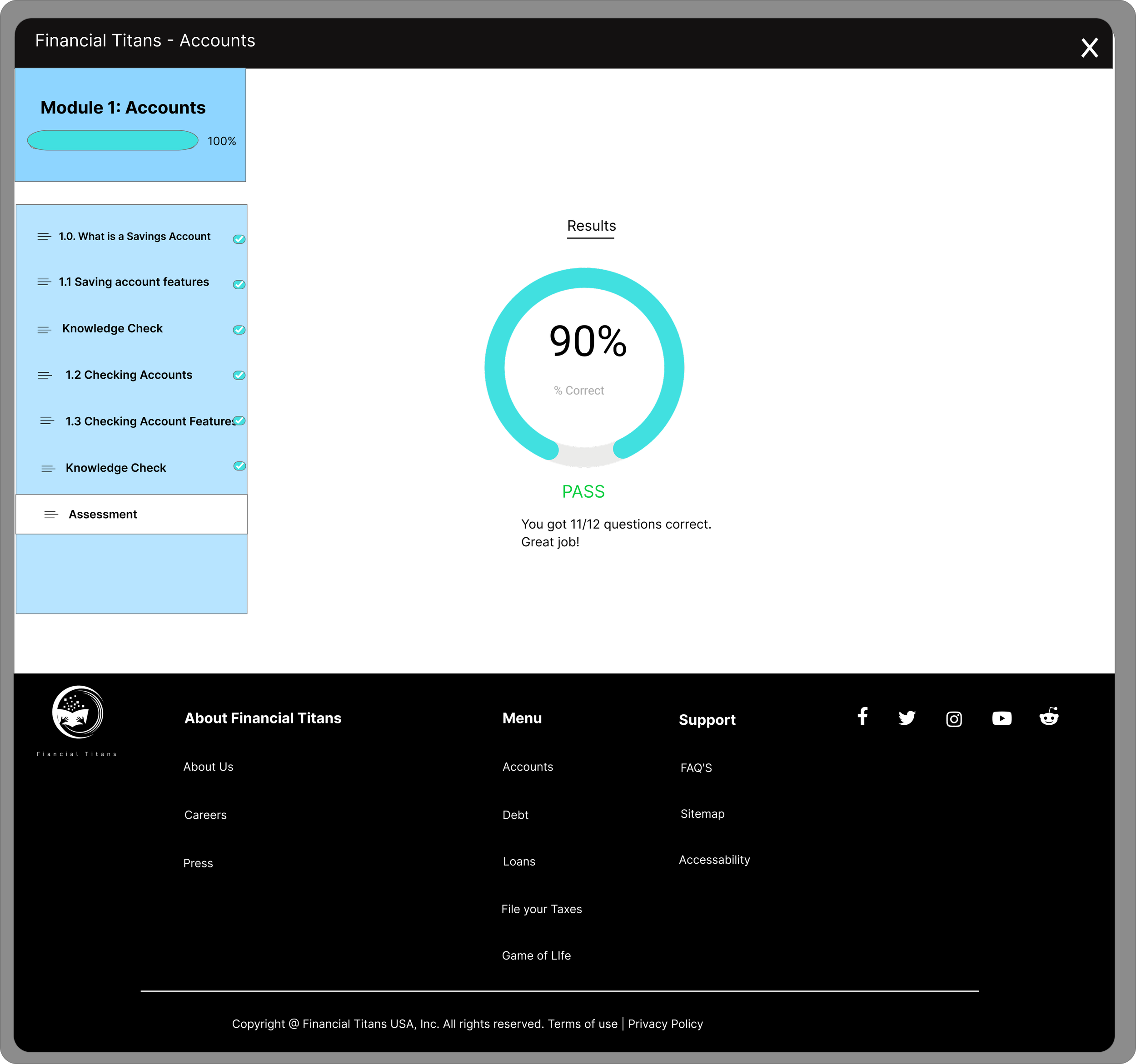
Grades page

Profile Home page
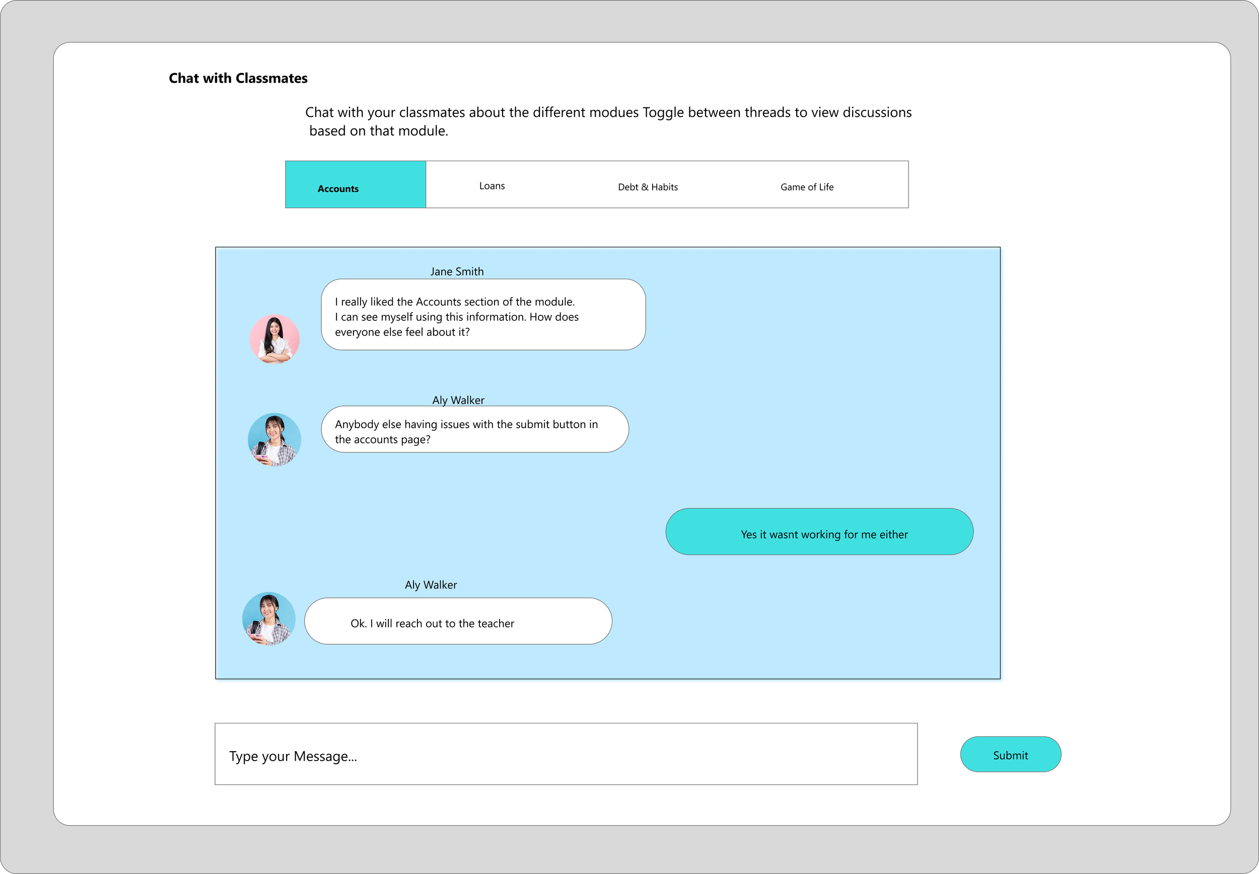
Our feedback was that a messaging feature for students to ask & answer questions was very helpful but the initial chat feature was not intuitive. We decided to build it out by adding different categories for users to narrow down their searches and an FAQ’s page.
Instructor Bio Home page

3. Changed the Messaging feature
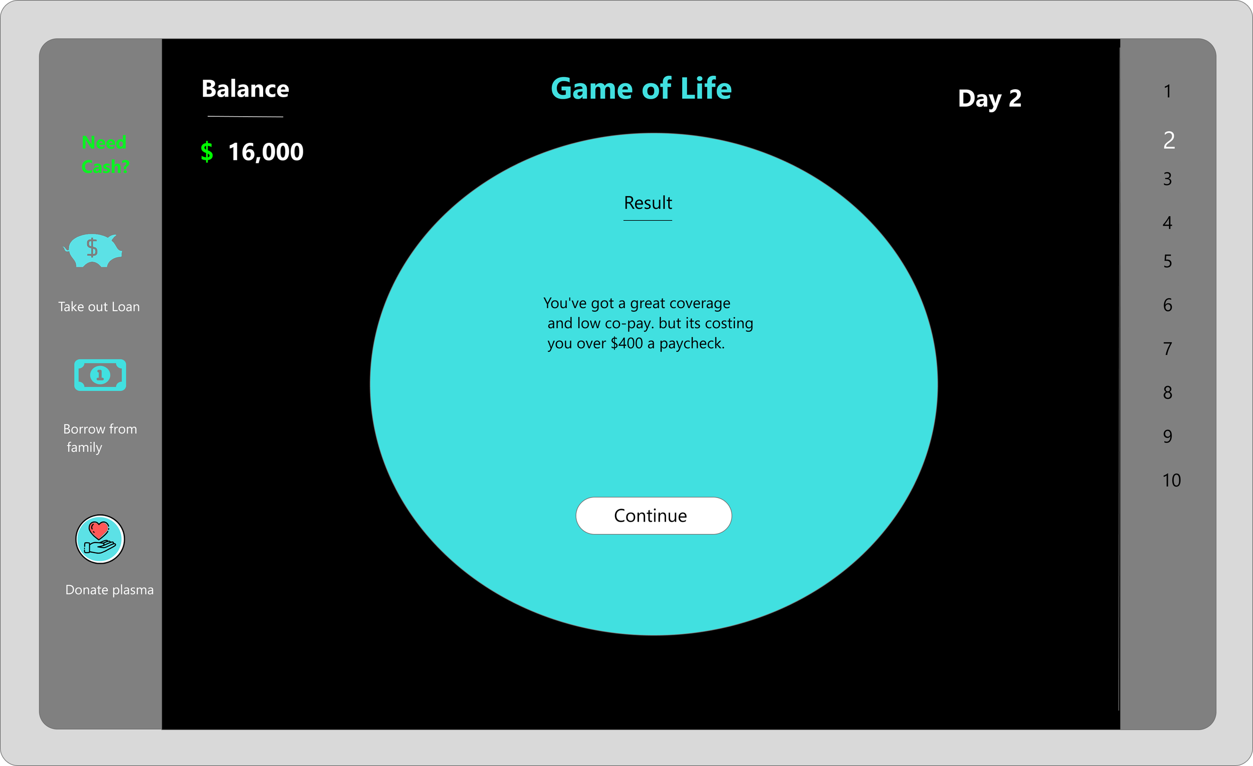
A main problem we faced was how will our high schools retain the text-based information, especially if they are not immediately joining the workforce right after high school? We created an interactive game to test users financial literacy concepts.
Results: User satisfaction with our website increased. Users were more likely to use our website with the added pages and features
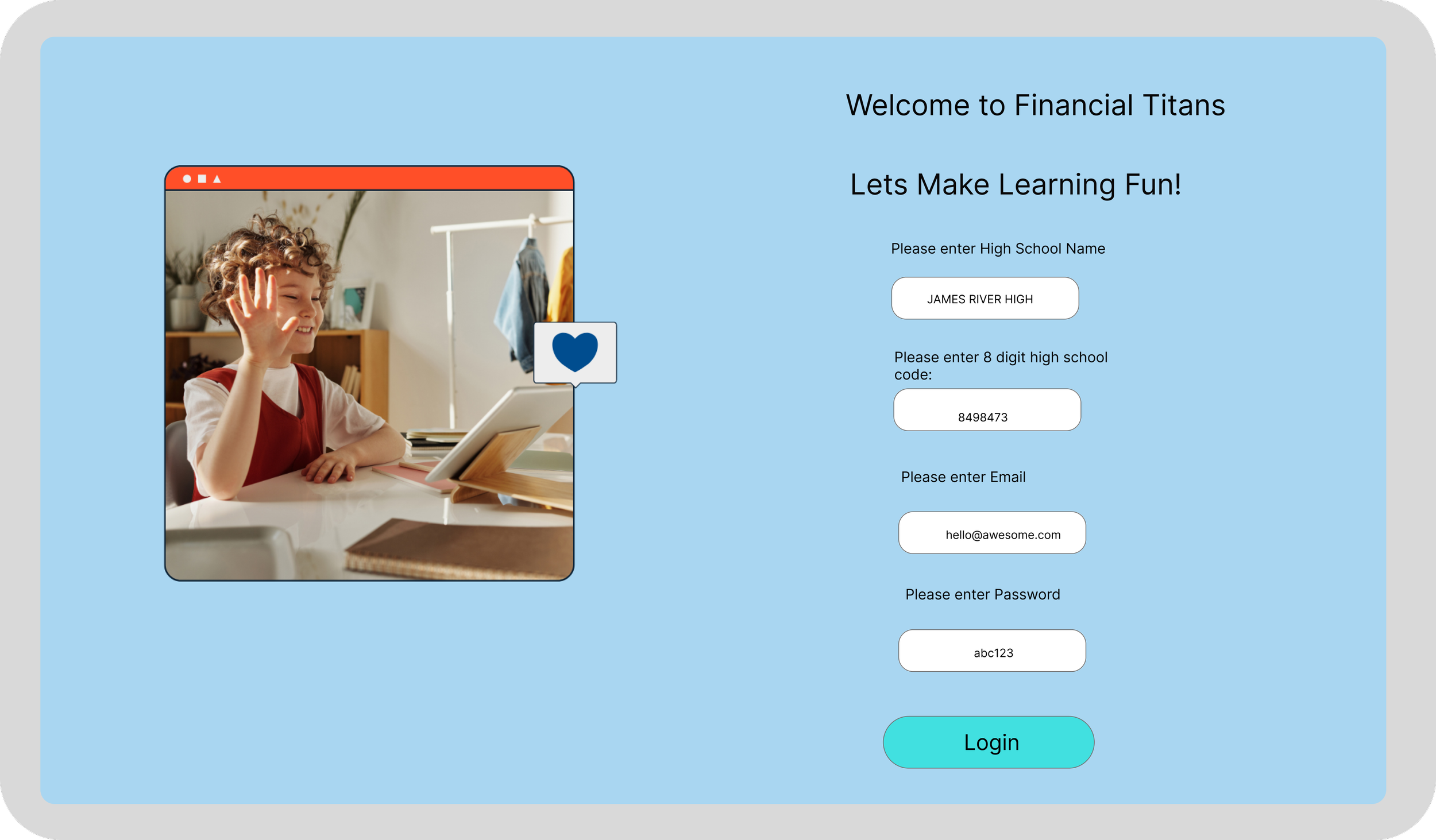
Before
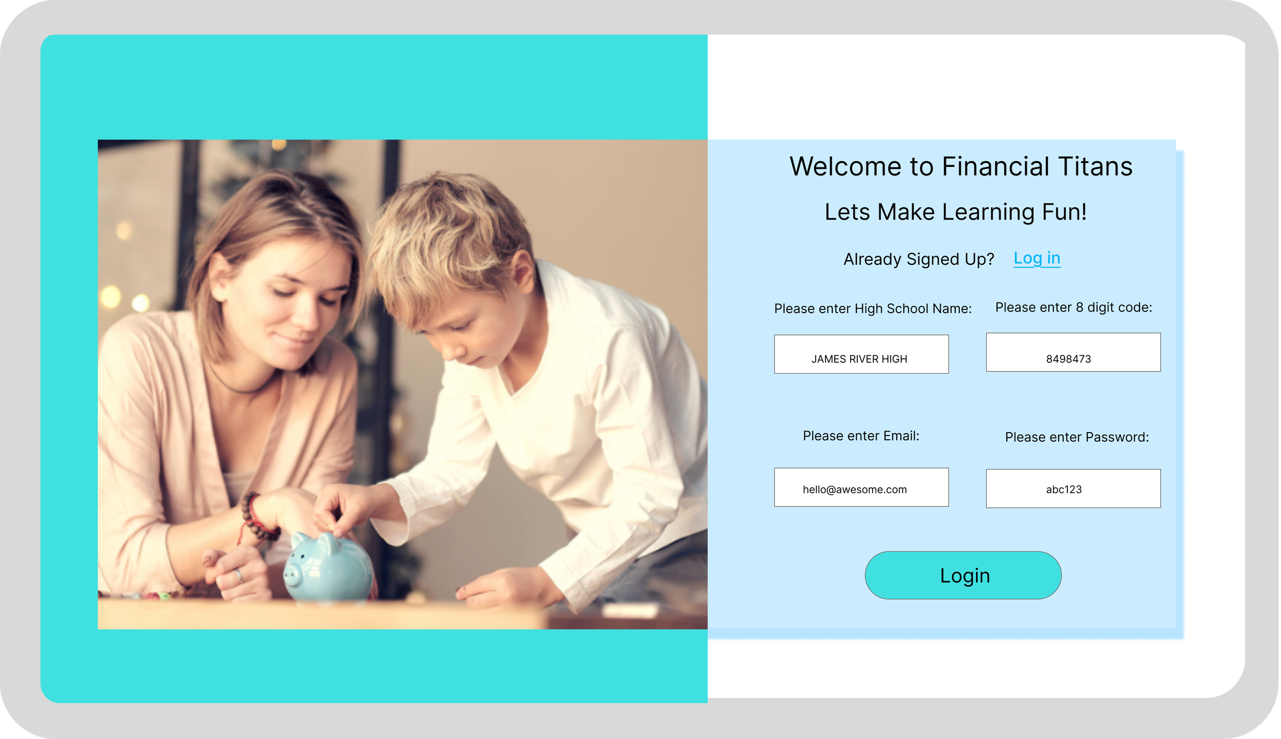
After

After
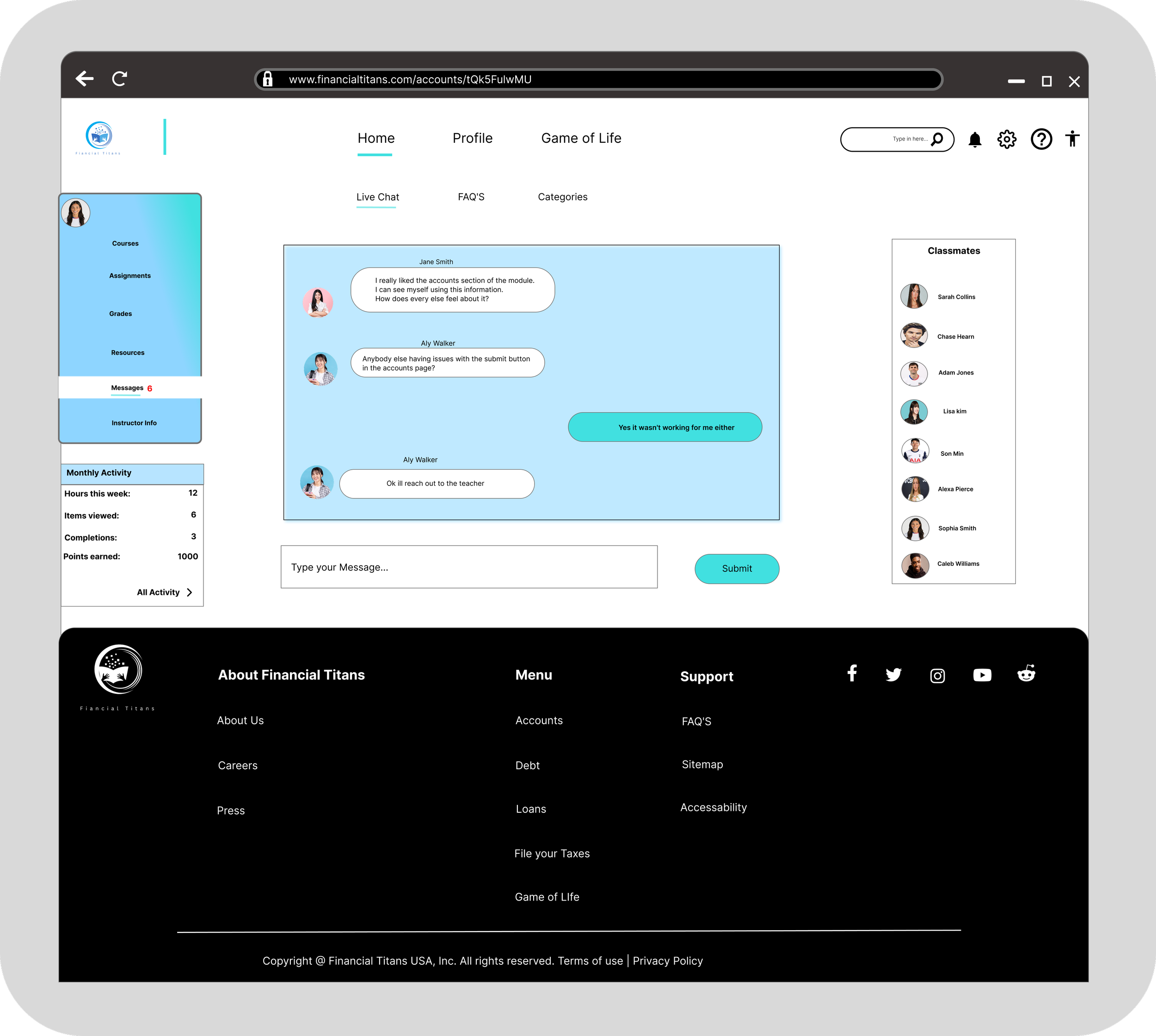
Results: Users loved the separation of threads. They particularly liked the “Troubleshooting thread” and the “FAQ’s page”.
Result: Users said our game cemeted the knowledge they learned from the course and were more likely to recommend this course to others.


After


Before
4. Created Interactive Learning Game

Next Steps
Build out the “All-Activity” feature to show how many hours per week spent learning, how many in course rewards you earned etc.
Lessons Learned
This was a large project and large projects have the ability for scope creep to occur and its very important to keep track of what is necessary for the Minimum Viable Product and that’s it.